Well, in today's case it's going to be kind of a design of the week. I have spent ages searching for the artist's name and whether or not the pieces were done by an individual or various designers but anyway, today's showcase is on the art of Flight of the Conchords. In case you don't know Flight of the Conchords are a band from New Zealand, popular also for their HBO TV show. A little bit of a spoof/funny rock band, this is reflected very much so in the artwork for their series, albums and promotions. Recently, I've been falling back in love with the more hand-rendered look and the band certainly grab on to that style and run away with it.
 |
| As you can see, the band is really colourful and mad. For their recent tour, the due created a tour poster individual to each date. This piece is much more extravagant than the one I got in Manchester! |
 |
| A little different from the hand rendered look, I love the simplicity of this piece in contrast to the previous image. No corporate image seems to be kept by the band, with the sporadic nature of the designs and fluctuation in style itself becoming their corporate image |
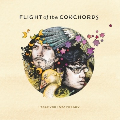 |
| This piece, for FOTC's second album, once again uses sketches rather than pure digital artwork. Despite the sombre looks of the pair, you still can't help but laugh at the sight of a random duck on the artwork! |
 |
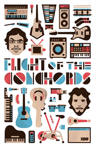
| Above is the TV series cover for the second series of the programme. The use of the oversized heads became a trait for the series, featuring on the posters, DVDs and show titles |
 |
| Their first official album on a major label once again plays around with the idea of chaotic imagery. Colours used are very vivid and I feel that everytime I look at this piece, I spot something new which I haven't seen before |
 |
| Poster to coincide with TV series. Love the copy beneath and the reference. The simple lines drawings upon the baby blue background work great |
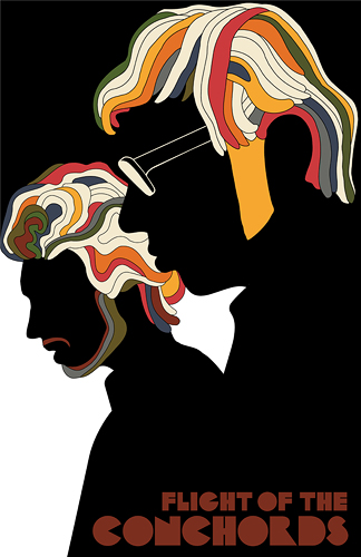 |
| Something all you designers out there will recognise, a brilliant parody of the infamous Milton Glaser piece. It's great how you can still recognise the pair even in this get-up! |
There's nothing better than design that doesn't take itself too seriously and makes you laugh and crack a smile!

I share your love for this artwork. Its very unique, light-hearted but very skilfully designed. I love the band and wonder where they'd be without the over-sized heads (genius) and random duck. You've picked out the features brilliantly, I think its all ace!
ReplyDelete