Probably because of how long I've used them for in comparison to Macs (well over a decade in comparison to just over a year) but I still can't get used to them. Spent half of my class today with my little finger searching for Ctrl. The class in which we got our workbook! Seems like my kind of thing, 23 illustrations what we've got to work up on, well, Illustrator. Didn't get far in class but I've been having a little go at them since I've been home, I can't believe we have three weeks to do them for half of our grade, seems rather nice of Leeds Uni! On another note, it's pasta crit time tomorrow...DUH DUH DUHHH!
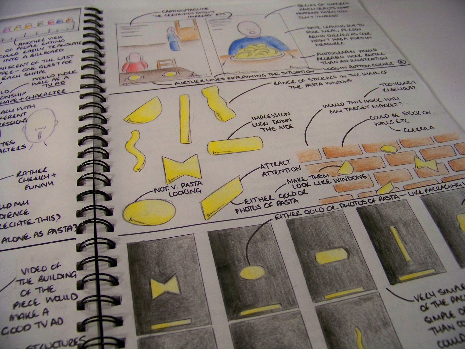
Spent the past week just coming up with some ideas for campaigns and the media which I could use to portray the campaigns etc. Had a few ideas but seem to have stuck on one, rather simple idea (which I am hoping is approved tomorrow as it would make my life lovely). Running with the unique windows of my brand as the selling point, using them across the potential campaign to create a strong recognition of the packaging and design when seen in store. Literally thinking black background, gold/pasta filled windows on. Potential tagline of 'What's your Impression?' or something along those lines (trying to include the audience and asking them which shape of the range is their favourite; I'm thinking this line is gunna need a lot of work). Very minimal, much like my lil' cylinders and I'm scared the tutors may think 'oh, what a cop out' but simple sells right? In terms of media, the simplicity of the design makes it easy for my to create adshells, billboard, an animation (for tv or web), website, promotional carrier bags and a magazine campaign. We're only meant to be doing two media but I may end up doing more to make up for the simple look. Maybe. Anyway, one of the ideas was to create a structure within an adshell which could actually hold pasta, recreating the packaging itself and creating that bit more interest. May be hard to create this across other areas of the campaign though. Anyway, here are a few sketches and pages from my sketchbook with my other ideas too (none seem quite as strong/desirable as my main idea so fingers crossed for me tomorrow guys):
 |
| Initial brainstorm |
 |
| One of my messy sketch pages |
 |
| Another messy page of my brain exploding |
 |
| Neater ideas |
 |
| Few more ideas including a concept of people not impressing as they haven't used Impression. Not the strongest of ideas... |
 |
| You can kinda see what I mean with the bold and simple thing. Few ideas for outcomes |
 |
| Few more media ideas |
Bold and effective? Or a bit too simple? Let me know what you think, remember, it's got to reflect my brand and its values!


Simple? yes. But not "too simple"
ReplyDeleteI think its very effective. I'm a strong believer (in situations like this) that less is most certainly more. I would say that I'm personally drawn in by short, sharp, bold taglines and advertising slogans in general. "Just do it" can say a lot more than a few lines. Best of luck