
Showing posts with label sunday. Show all posts
Showing posts with label sunday. Show all posts
So it's Sunday 11...
Just quickly checking in! Had a mega busy week of moving house and decorating etc so I haven't had the time to keep you guys up to date with my antics, I apologise. Love our new house and the painting I managed to get done before coming back up to Leeds. Nothing better than being back home in Sheffield for a while, especially being able to overdose on Henderson's Relish, the hidden treasure of Sheff!

So it's Sunday 10...
During my rather unrelaxing weekend of getting ready to move/return to Leeds/revise, I found the time to sit down for five minutes and have a little gander through a couple of newspapers when a photography article caught my eye (with the images featured especially gaining my attention). As a huge fan of countdowns and competitions, I enjoyed reading about Digital Camera Magazine's Photographer of the Year 2010 competition and having a look at the overall winner and other subcategory successes. Really made me realise that not only photography skill is involved but also the ability to seek out and capture a particular moment, with some involving skill and time and others created merely via luck. Below is a link to the competition page and a few of my particular favourite entries which perked me up during a time of burst pipes, decorating ideas and houses that lack electrcitiy!
 |
| Overall competition winner, Jon Wright with his piece 'Exit Wave'. Really stunning piece which took me away from my winter blues and this miserable whether we've been having recently |
 |
| Fire Fighter by Buchachon Petthanya. This was the piece what really dragged my attention to the article in the newspaper, coming second to the overall winner in the adrenaline category. Unbelievable how he managed to capture this piece and highlights a photographer potentially putting his life in danger for his art |
 |
| This piece, 'Jump', by Wayne Lawes was unbelievably achieved in one shot, taken for the photographers own entertainment and for the dancer's portfolio. To say it portrays such a strong and powerful man, it conveys a great sense of elegance and beauty at the same time. Wish my camera was waterproof! |
 |
| Even though this image wasn't shortlisted in the competition and only commended, I found myself really drawn to it whilst looking through the entries. As a person who loves to shoot water, as seen with my hydrophobia work, I love the shifts in focus on this piece, with some droplets blurred and others not. Seems a bit magical! |
Hope you guys enjoy following the link and picking out your own favourite photos, let me know which ones you liked and what you reckon to my favourites! I may have to upgrade my camera sometime soon so I can try and achieve some of the detail captured in the images above!
So it's Sunday 9...
Haven't really got anything to be showing you guys now the first semester is over! Have yet to start writing up my online project but I have till after Christmas so I'm taking a well deserved break! I do have something exciting to tell you about...
...I saw Gok Wan yesterday! His fashion Fix programme was filming in Leeds and I went along to it with my sister and wow, he's ever so lovely! Ignoring the huge delays and re shoots, the show itself was fantastic and that's coming from someone who isn't generally 'with it' in terms of the fashion world. They didn't tell us exactly what the four themes were but they seemed to be some sort of neon (you could kinda tell which was designer and which was Gok and I must say, designer won for me here, she wore a gorgeous red pencil dress in comparison to red leather trousers and a green coat), angelic (again, designer was better, the cut of the dress was gorgeous and just floated on the model), winter (designer looked nicer but I personally would have worn the high street one) and geisha (although designer was lovely, Gok put together a huge sparkly number which had me as soon as I saw it!). Despite still feeling ill, I had a great day, something which I didn't expect as a fashion lacking graphic designer!

...I saw Gok Wan yesterday! His fashion Fix programme was filming in Leeds and I went along to it with my sister and wow, he's ever so lovely! Ignoring the huge delays and re shoots, the show itself was fantastic and that's coming from someone who isn't generally 'with it' in terms of the fashion world. They didn't tell us exactly what the four themes were but they seemed to be some sort of neon (you could kinda tell which was designer and which was Gok and I must say, designer won for me here, she wore a gorgeous red pencil dress in comparison to red leather trousers and a green coat), angelic (again, designer was better, the cut of the dress was gorgeous and just floated on the model), winter (designer looked nicer but I personally would have worn the high street one) and geisha (although designer was lovely, Gok put together a huge sparkly number which had me as soon as I saw it!). Despite still feeling ill, I had a great day, something which I didn't expect as a fashion lacking graphic designer!

So it's Sunday 8...
Apologies for the lack of entries this past week; it hasn't been the best one in history to be honest. First there was the evacuation Tuesday night, faffing about sorting out my binding, 3rd year anniversary with my boyfriend (which was lovely but led you with no Friendly Friday) and then I've been (and still am) ill all weekend. Typical all this comes in time for hand in week. Luckily, I'm all done! I have been for quite a while but you know me by now, nothing like a little bit of wittling in between! Booklet for pasta is all finished and as I mentioned the other day, I managed another media piece. I'll post some photos of the booklet tomorrow in the pre-crit entry. My workbook is also finished, turns out I'd already finished it but thought there was more to do; silly moi! So today's task are burning and labelling CDs and the painful task of reducing file sizes. Then I'm free! Apart from a deadline on the 10th of January and an exam on the 18th but we deserve a break for a while (I'm sure all the other 2nd year G&CD guys will agree). Going to try and sort out some work experience, either in teaching of graphic design (or both) over Crimbo but I'll leave worrying about that till later. In the meantime, here's a little guy from the workbook that I had to work up on Illustrator, I've started to think of him as cute rather than creepy!


So it's Sunday 7...
As you guys have gathered, Friendly Friday isn't a weekly thing like my other blogs so apologies again for not entry on Friday. If anyone wants a recommendation on here, send me a message and we can talk it through!
Anyway, in other news, I've once again spent a nice weekend at home amongst all the snow in Sheffield. The marketing report was sent in on Thursday, I've almost completed the Illustrator workbook and my pasta adverts didn't need much changing. Yet still I've been sat working! I'm currently getting my second pasta brief booklet ready to be printed after the Tuesday crit (fingers crossed nothing much more needs changing after then) and placing my adverts in situe. Currently I have 8 different outcomes across 2 media channels so I'm a little worried as the outcomes aren't very different from on another and the 2 channels are a little boring. Should I try coming up with another media outcome? I've made all the adjustments proposed to my pieces and they do look a lot better with the font sizes a little larger so I'm feeling kind of happy about that! I would post them up today but I'll keep you in suspense and post them tomorrow in my pre-crit entry (haha)!
In the meantime, here's a little piece I found about a year ago whilst trawling the web for inspiration. It's not of any relevance to my current project but it gave me a little giggle as I was searching through my computer the other day:
Anyway, in other news, I've once again spent a nice weekend at home amongst all the snow in Sheffield. The marketing report was sent in on Thursday, I've almost completed the Illustrator workbook and my pasta adverts didn't need much changing. Yet still I've been sat working! I'm currently getting my second pasta brief booklet ready to be printed after the Tuesday crit (fingers crossed nothing much more needs changing after then) and placing my adverts in situe. Currently I have 8 different outcomes across 2 media channels so I'm a little worried as the outcomes aren't very different from on another and the 2 channels are a little boring. Should I try coming up with another media outcome? I've made all the adjustments proposed to my pieces and they do look a lot better with the font sizes a little larger so I'm feeling kind of happy about that! I would post them up today but I'll keep you in suspense and post them tomorrow in my pre-crit entry (haha)!
In the meantime, here's a little piece I found about a year ago whilst trawling the web for inspiration. It's not of any relevance to my current project but it gave me a little giggle as I was searching through my computer the other day:
 |
| Ahh the impact of a simple illustration, gotta love it! |
So it's Sunday 4...
Ahh, rather boring weekend on my half to be honest, slightly lacking work due to feeling under the weather and overworking myself. Dodgy takeaway on Friday night did nothing to help this either. So, what do I have to fill you in with? Well, in the end I followed everyone's advice (apart from the tutors) and stuck with my name of Impression for the pasta brand. Got plenty of justification from my target market why I should keep it so it is staying. Nervously staying but staying. Booklet is now complete for that project apart from potentially another in situe shot of my brand (they thought my supermarket shelving piece was a little cluttered and wanted a shot of it along with a few other brands on a white background...not what I class as in situe but o well, I'll eventually get round to it). Here's a sneaky peek...
Started the pasta marketing/promotion brief now, had a day of research which has gone really quickly! Already got a few ideas which run along the 'mundane' styles of advertising except with a twist. We were told we either had to market a unique aspect of our design or come up with a wicked, individual campaign strategy. I'm hoping my windows are a unique and recognisable aspect for me to run with...Decided to create a little survey too which has ended up being pages and pages long but at least I'll get the info (hopefully) that I want and need from my target market.
On a more interesting note, I ended up stumbling upon a few interesting images whilst trawling the internet for advertisements. The following is rather controversial and I apologise now if it offends anyone (it certainly did me) but I couldn't believe how hard-hitting and clearly it got it's message across:
Just wow to be honest. So hard hitting! I was extremely shocked when I saw this but considering WWF and their normal shock tactic advertising, it seems pretty tame in comparison to previous imagery they have used. What do you guys think to it? I'll leave you to ponder...
 |
| A very sneaky peak might I add, don't want to give too much of the game away yet |
On a more interesting note, I ended up stumbling upon a few interesting images whilst trawling the internet for advertisements. The following is rather controversial and I apologise now if it offends anyone (it certainly did me) but I couldn't believe how hard-hitting and clearly it got it's message across:
 |
| In case you can't quite see it, the message reads 'The tsunami killed 100 times more people than 9/11' |
So it's Sunday 3...
Back to the workhouse tomorrow after a really nice weekend spent at home. Ended up becoming not only the proud owner of my third set of Take That tickets but also, as of an hour ago, Bon Jovi tickets too! So it's mostly been a weekend of music (and as you can see, my music taste is extremely varied).
Anyway, enough of my strange tastes, onto design...
Well...in terms of pasta, everything is now in situe! Not 100% happy with it, still don't think it looks really realistic but you can have a nosey...tomorrow! Would upload it now but I'll build up the suspense and let you all have a peak tomorrow in my pre-crit blog entry.
In the meantime, I'll give you a peak at my marketing group's report cover:

Spent a lot of my weekend putting our report on Oxfam and Marks and Spencers Fashion. Still got a bit to go and only a few weeks left so as per, I'm in panic mode but I'll try remembering to breathe. I've been trying to make the info look all pretty in Illustrator which I've rather enjoyed!
Feel awful not sitting on a PC longer this weekend and working but I haven't seemed to have anything to really do! So now I'm gunna love you and leave you now and enjoy the rest of the free time I seem to have before my final crit on Tuesday and intro of the new brief!!!
Anyway, enough of my strange tastes, onto design...
Well...in terms of pasta, everything is now in situe! Not 100% happy with it, still don't think it looks really realistic but you can have a nosey...tomorrow! Would upload it now but I'll build up the suspense and let you all have a peak tomorrow in my pre-crit blog entry.
In the meantime, I'll give you a peak at my marketing group's report cover:

Spent a lot of my weekend putting our report on Oxfam and Marks and Spencers Fashion. Still got a bit to go and only a few weeks left so as per, I'm in panic mode but I'll try remembering to breathe. I've been trying to make the info look all pretty in Illustrator which I've rather enjoyed!
Feel awful not sitting on a PC longer this weekend and working but I haven't seemed to have anything to really do! So now I'm gunna love you and leave you now and enjoy the rest of the free time I seem to have before my final crit on Tuesday and intro of the new brief!!!
So it's Sunday 2...
It's been another day of pasta in the Lianna household. Had a day off from designing yesterday which resulted in an A&E trip so I'm getting my head down on this loooong Sunday. As I mentioned in my Crit Day blog entry, I'm still running with Impression as a name and aiming at the average pasta user who wants a premium look (to impress, see, it fits!) at a cheap price, with the added convenience of a portion measurer. Still working on the design but I thought I'd give you a quick glimpse at what I'm currently working on...
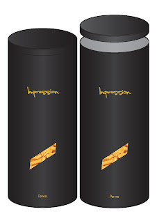 [I know that the text isn't in perspective on the rounded cylinder but that's my next job hehe]
Anyway, I'm not sure whether I like this or not. Spent this week working on layouts and colours and this is what I've come up with. I'm hoping that the font still makes the product look posh yet still approachable for the average mom shopping in a supermarket etc. What do you reckon? Moved the window 3/4 down as the class said and I kinda like it, balances out well with the logo 3/4 up. Speaking of the logo, do you think a purely text logo is enough or should I add more ie a symbol etc? Toyed around with the idea of making the handwritten text look like chalk to go along with the menu boards at restaurants but my good friend (see my Friendly Friday blog) suggested it might lower the tone, especially when I originally settled on gold. After quite a bit of deliberation, I decided in the end to add the pasta name at the bottom really tiny, didn't really take away from the minimal design and it informs the audience should they not make the connection with the window shape. Settled on a black lid too rather than a differing colour, didn't want it to look cheap.
Could you guys imagine seeing this as a believable product on the shelves? Does it look too high end that a working mom wouldn't buy it for example?
Obviously I've still got quite a bit of work to do on it so I better get on with it and stop rambling to everyone on here!

Anyway, I'm not sure whether I like this or not. Spent this week working on layouts and colours and this is what I've come up with. I'm hoping that the font still makes the product look posh yet still approachable for the average mom shopping in a supermarket etc. What do you reckon? Moved the window 3/4 down as the class said and I kinda like it, balances out well with the logo 3/4 up. Speaking of the logo, do you think a purely text logo is enough or should I add more ie a symbol etc? Toyed around with the idea of making the handwritten text look like chalk to go along with the menu boards at restaurants but my good friend (see my Friendly Friday blog) suggested it might lower the tone, especially when I originally settled on gold. After quite a bit of deliberation, I decided in the end to add the pasta name at the bottom really tiny, didn't really take away from the minimal design and it informs the audience should they not make the connection with the window shape. Settled on a black lid too rather than a differing colour, didn't want it to look cheap.
Could you guys imagine seeing this as a believable product on the shelves? Does it look too high end that a working mom wouldn't buy it for example?
Obviously I've still got quite a bit of work to do on it so I better get on with it and stop rambling to everyone on here!
Subscribe to:
Posts (Atom)