Showing posts with label work. Show all posts

It's all on the move here in Sheffield

Well, I was rather shocked when I opened my curtains this morning! Snow again, and lots of it! Not that I'm moaning, I love the stuff and having the excuse to wear my silly wellies! In other news, we got the keys to our new family home here today so I took up the opportunity to pick up my camera and have a nosey in the garden at all the lovely snow as a break from revision (note: the quality of some of these photos is a little off as I didn't realise that the windows I were taking them through were mucky until I left haha).

I tend to have a thing for capturing water and water droplets, especially after my Hydrophobia brief (see http://www.liannamaydesign.co.uk/). At the time, sadly the falling snow had turned to rain


Peg love! Whilst inspecting our new back garden, I found these two having a little peg hug. The cutey girliness inside of me is reflected in the image, bless!


Taken through a mucky window like a nugget but kind of like the grainy effect achieved

Milk Bottles

Not the best pictures I've ever taken but it was nice to be running around with my camera again, first time in a while, especially seeing as Photography 2 module starts when I return to uni!

Ok, so maybe one more before Christmas!

You all secretly knew I'd be back on here, I can't seem to get enough of the place! Anyway, I thought I'd let you know that my CV and past three months worth of newsletters are now live and available to download at www.liannamaydesign.co.uk/downloads yay! I apologise for it taking quite a while but they're there now, call it an early Christmas pressie. Somehow I've had around 10 downloads of each file today so if you have been one of the lucky ten, please let me know what you reckon to them and if you have any constructive feedback to give me. I know they are rather simple but that is the look I am trying to aim for; bold, corporate and modern with the small twist of flashes of bright colours and quirky language which represents who I am as a person. Once again, I've been working on the pdf booklet today for our Online Promotions brief and with each page I do, I tend to add another to the minimum of 15. So far I have finished around 9 pages and you make think 'wow, nearly done'. No way. I've ended up with around 7 final outcomes due to the expansion of my online presence (website, blog, Twitter, forums, flickr, tumblr, cv download, newsletter download) so now I feel the need to create development pages for them all properly. At the moment, I'm estimating that I'll finish up with around 20 pages (including the reflective report, not including contents and cover) which is scaring me. Anyway, in order to get a bit of feedback, I thought I'd post a few of my completed pages on here for all to have a gander at. Once again, very simple and following formal grid structures. Finding it very hard to achieve high quality print screens which I might have to deal with again later (has anyone else been having this trouble?). Just hope they aren't seen as boring and given a bad grade!

Website Portfolio presentation page

Blog presentation page

Twitter presentation page

CV download presentation page

Newsletter download presentation page

Forum Participation presentation page

Others (Flickr and Tumblr) presentation page

Signing off for Christmas!

Hey guys! Just thought I'd give you all one last blog entry before I leave you all to enjoy your Christmas (and so I can enjoy mine haha)!

Lack of entries lately have been due to moving back home for the holidays and several nights late night shopping to get those last few presents (I cannot believe that Meadowhall is open till midnight, crazy stuff). Currently (as usual) stressing about things I've got to do, this time being finishing my online promotion work (luckily all the online things are done, I'm just part way through constructing the booklet) and revising for my marketing exam (which I have yet to begin, oops). In the end, I decided to run with the theme already displayed on here and on my web page, with simplicity and minimalism being 'my thing'. Currently constructing my booklet and CV (gulp) in the same way but at the minute I'm worried they don't look 'designer'-ish enough. Will hopefully post them up on here if I have time amongst the mass chocolate consuming and turkey eating.

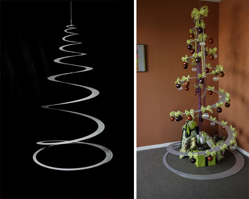
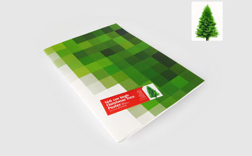
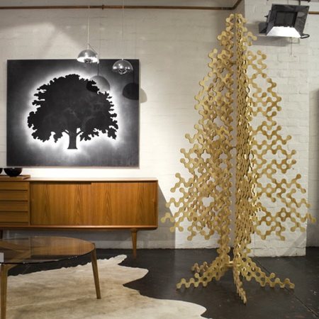
Ended up having a little explore of Google whilst writing this blog and came across many different variations of Christmas trees in the 'modern' sense, here's what I found;


Spiral cut suspended tree


Christmas tree poster as an alternative to the real thing

Another alternative tree, bare and minimal

See, to me, all the above trees seem very innovative in terms of their design and look and yes, they do go along with the modern trend, but is it just me who feels they seem a little cold and lack the festive spirit? The idea of replacing a tree with a poster seems to extreme to me and even though I love minimal designs and simplicity, there is a point where people need to stop, especially with a Christmas tree! I just seem to love the tacky lights, tinsel and bauble idea and would much rather have the following in my home during the season to be jolly;


Ours at home is a little more wonky and uncivillised compared to this but isn't that what Christmas is all about?!

Anyways, enough of me rambling! I should be back on here between Christmas and New Years with further updates about the life, times and designs of me so in the meantime, everyone have a great Christmas!

A potential change in direction?

Like a nugget, I was up until 5am this morning pondering over a new direction in branding 'me' as a designer. As you all know, I've run this blog and the corresponding website, Twitter and forums for a while now but I'm starting to feel they're a little boring, especially when it comes to presenting them in my fifteen page booklet. I uploaded a couple of snippets yesterday and got some lovely feedback via Facebook so I've decided to upload some better quality images for you guys to have a look at and let me know what you think. As a person, I'm really colourful and energetic and I'm starting to lean a little more towards my new design to represent and project this. However, the new design to me feels like I've seen it before. Anyway, enough of me rambling on and on, here are the images; let me know what you reckon!


Current website design, very plain and simple but I'm only really liking the homepage, the others seem really boring

Apologies for the poor screenshot, not created a particular layout here, just exampling a potential new logo and colour scheme? Can you read the logo?

Pondering...

I know, I know, I should be having a short break before getting back on the working bandwagon but I've ended up stressing over my online promotions project tonight (what can I say? I like to be extremely efficient haha). Anyways, I've been looking at some layouts and griding bits and bobs up for my 15 page booklet but feel I'm stuck between a rock and a hard place in making it interesting and innovating rather than a mundane 'I love Helvetica' graphic design piece. Also contemplating totally revamping my website with new logos and layouts and everything as I've got myself under the idea that currently, it is rather boring (although the new things I keep coming up with also seem a bit generic). Another issue I'm having it matching my design booklet to the website/logos etc. Do I have to do this you reckon? Is anyone else doing it? I feel like I should but when put together, I start not liking my website as it restricts booklet designs. I need to stop moaning haha! Anyone fancy dropping me a few comments/ideas/inspiration? Would be very much appreciated!


Kinda hard to see as there's no border. What do you reckon to the layout and logo? Boring? Argh!

Another example page from my current website design

A new little idea for a logo but I feel like I've seen it hundreds of times before and I don't really think it's me :/

(there's a little link if you fancy popping over there, having a look and giving me a hand...please?)

In other news, I've decided if all else fails in the world of graphic design/teaching for me, I shall become a cook. I made a mean Christmas dinner today, amazing when I don't even eat veg and had to cook tonnes!

Ooo, whilst I remember, has anyone seen the new Andrex puppies advertisement (which has conveniently just come on TV as I typed that, creepy!)?


Is it just me who doesn't like the new CGI puppies?! Bring back the real, cute ones please Andrex!


Crit Tuesday 8...IT'S ALL OVER NOW!

Sorry for the delayed entry guys, had an evening of utter relaxation as I handed in my pasta work a day early. WOW, all over until 2011 now! I'm sure you'll all miss my crit entry blogs but they'll be back eventually and hey, you might even get the chance to crit some of my personal work over the next few Tuesdays in the Christmas period! In terms of the final crit, despite the morning class being cancelled and only less than ten people turning up, it still went ahead. The tutors said they wouldn't give any detrimental feedback as we had less than 24 hours to make changes and print/bind but it was painful! s with previous weeks, they loved my idea and the poster adshel designs but now they reckon that my magazine advert would have been bettered via the use of purely text and the same images as the adshels. Something which I'd avoided to prevent repetition. One thing I've learnt over this semester is how much tutors change their mind, with two of them really liking my magazine ideas of the past two/three weeks so I'm not letting it get to me, I handed the piece in anyway, o well! Funniest thing about yesterday? They've now all gone back to loving my brand name! Talk about changing your mind guys!


GOODBYE PASTA!

Would very much like to feel better but in the meantime...

...here are a few pictures is a picture of my final bits and bobs (seemed silly posting loads, you get the drift with one picture). Not exactly beautiful or exciting but fingers crossed for a good grade. For some reason, the morning group haven't got a crit tomorrow but our afternoon session has so hopefully the flu will have gone by then and people will be able to understand me! I've got everything finished now (apart from the online stuff what's in for next semester) so I should be able to stop panicking. Should being the key word...oops!

Messy? I know. Good grade? I hope. Fully filled two sketchbooks? Yep *gulp*

So it's Sunday 8...

Apologies for the lack of entries this past week; it hasn't been the best one in history to be honest. First there was the evacuation Tuesday night, faffing about sorting out my binding, 3rd year anniversary with my boyfriend (which was lovely but led you with no Friendly Friday) and then I've been (and still am) ill all weekend. Typical all this comes in time for hand in week. Luckily, I'm all done! I have been for quite a while but you know me by now, nothing like a little bit of wittling in between! Booklet for pasta is all finished and as I mentioned the other day, I managed another media piece. I'll post some photos of the booklet tomorrow in the pre-crit entry. My workbook is also finished, turns out I'd already finished it but thought there was more to do; silly moi! So today's task are burning and labelling CDs and the painful task of reducing file sizes. Then I'm free! Apart from a deadline on the 10th of January and an exam on the 18th but we deserve a break for a while (I'm sure all the other 2nd year G&CD guys will agree). Going to try and sort out some work experience, either in teaching of graphic design (or both) over Crimbo but I'll leave worrying about that till later. In the meantime, here's a little guy from the workbook that I had to work up on Illustrator, I've started to think of him as cute rather than creepy!

Designer of the Week 7: Lianna May Wragg

I know, I know, shameful plug here. I've been sat working on my pasta project all night (which I've finished but keeps wanting to crash on me as I make the file sizes smaller) so in the meantime, have a quick visit to my website, it's getting lonely!


And also keep your eyes on it over the next few weeks. There are some big changes and updates in store as soon as pasta is out of the window! Some coming on here too...

Crit Tuesday 7 (on a Wednesday)

Sorry for my lack of entry yesterday guys, had an extremely hectic evening. The apartment block I live in lost power from half 6 till 2.30am so I spent most of my night evacuated into the Refectory at University. Don't think I've drank so much tea in my life!

Anyway, enough of my rambling, I'm warm and home and dry now so here's the overview of yesterday's crit!

  • Well...it went well! Again! After changing my type sizes, there were no more suggestions or changes to be made to my designs! Yippee!
  • The particular tutor we had yesterday wanted to see my third media (and everyone elses for some reason). Which confused everyone as the brief states at least 3 outcomes over 2 media channels. And I've done 8 outcomes over 2. So I got confused...
See, if I'd have had my blog on hand last night, I would have asked you guys for you opinions. But sadly I didn't. So I created a third media anyway!

Althought I found that flyers were kind of a bad idea during my research, I decided to run with a flyer idea which could change this. After spending the entire afternoon on the internet trying to find out the name of the technique I had in my head, I finally found it. Lenticular printing. WOOP! Since then, I've quickly created four extra flyers, working on the idea that when you tilt them, you can see an alternative image eg. bow tie from one angle, farfalle pasta shape from another angle.

In terms of the rest of the project, I've finished the booklet now apart from the new development page for the flyers and a bit of back up work for my sketchbook. The end is in sight though people! I'm thinking, if the snow is a little better by tomorrow, I might go print in the afternoon and get it totally out of the way by tomorrow evening!

I might post up some jpegs tomorrow but at the moment, I'm on a bit of a role with the booklet so I'm not going to disturb myself haha!

Crit day tomorrow...if I'm not snowed in!

Wow, I don't know what it's like where you're reading this from but it's belting it down with snow here in Leeds! Great way to get into a Christmassy mood but bad times in terms of getting to the crit tomorrow. Which happens to kind of be the final crit as by next week's final crit we need to have already printed! Anyway, I'm not going to bombard you with posts and images for tomorrow, need to keep up that sense of mystery (plus I'd need to save loads of files as jpegs from pdfs and I've got more things to be doing than that haha).

As you know, I haven't really changed much since last week, just changed the font sizes slightly for each media and added better pack shots. Been messing around this evening putting things into situe (aint sure whether we definitely have to do this but I always enjoy this section the best) and I'm nearly done. Need to get cutting and sticking all the pages in my sketchbook but in the meantime, have a gander at a select few of my pieces and let me know what you reckon!

Magazine double page spread (with slightly larger text from last week's entry)

Magazine single page spread (double sided)

Magazine single page spread (double sided). Conveniently placed next to a pasta recipe in a woman's glossy magazine!
Adshel/poster design with slightly larger text

Poster in situe (not sure if I really like this one)

Gunna get a move on now, stick a few more in situe, get some cutting and sticking done and wrap up!

So it's Sunday 7...

As you guys have gathered, Friendly Friday isn't a weekly thing like my other blogs so apologies again for not entry on Friday. If anyone wants a recommendation on here, send me a message and we can talk it through!

Anyway, in other news, I've once again spent a nice weekend at home amongst all the snow in Sheffield. The marketing report was sent in on Thursday, I've almost completed the Illustrator workbook and my pasta adverts didn't need much changing. Yet still I've been sat working! I'm currently getting my second pasta brief booklet ready to be printed after the Tuesday crit (fingers crossed nothing much more needs changing after then) and placing my adverts in situe. Currently I have 8 different outcomes across 2 media channels so I'm a little worried as the outcomes aren't very different from on another and the 2 channels are a little boring. Should I try coming up with another media outcome? I've made all the adjustments proposed to my pieces and they do look a lot better with the font sizes a little larger so I'm feeling kind of happy about that! I would post them up today but I'll keep you in suspense and post them tomorrow in my pre-crit entry (haha)!

In the meantime, here's a little piece I found about a year ago whilst trawling the web for inspiration. It's not of any relevance to my current project but it gave me a little giggle as I was searching through my computer the other day:

Ahh the impact of a simple illustration, gotta love it!

Crit Tuesday 6

GOOD DAY! Had some really positive feedback today on both my magazine spread and adshell designs. So good that the only suggested improvement to be made was to potentially make the fonts a little larger so people can see them easily from the associated distances. Yay! I was expecting a need in changing the copy but Jim and the gang seemed to really like my tagline and concept and nothing was mentioned about the small copy at the bottom of the magazine pages so I presume that sounded ok! Printing meant the packaging examples on the magazine pages didn't show up very well so I shall have to get that sorted but other than that, all is good! In other Lianna news, the group marketing report is pretty much finished! We're aiming to print it and hand it in tomorrow before the Thursday deadline. Hopefully our content and outcomes go down well when being marked! Once that's in, it seems to be plain sailing, with the pasta project and illustrator workbook in before Christmas and my marketing exam and online self promotion coursework in after. I say plain sailing...ha!

Thought I'd share this with you guys aswell, caught a glimpse of it earlier:


Dell have a new logo! Having 700 creative agencies working for them got a little confusing, with their logo being slightly different and varying slightly in typefaces used etc. To solve this, they've created one single logo (very similar to the original) which will be used across the board an coloured in 'Dell Blue', a colour not available in any colour book. I really like it, ties in nicely with the circular designs they have on their products. Plus I love Dell, my beast of a graphics PC (I know, I know, I should be loving Macs but you've seen previously blog entries by now ha ha)!

It's Monday, that can only mean one thing...

...Pre crit entry! Well, it hasn't half been a stressful week. I've come up with a new concept which I'm not 100% confident with but I reckon that's because I'm waiting for tutor approval (so I hope I get that tomorrow afternoon!). The marketing deadline is this Thursday so I've been very pre-occupied with that and I've only just really got round to knocking out some visuals for the crit. My sketchbook is also pretty lacking at the moment in comparison to my previous brief but after Thursday I'm 100% back on the pasta (and Illustrator but the less said on that, the better). Anyway, enough of me ranting and rambling about work, here are some of the visuals I've got ready to present tomorrow.

Concept: You don't have to dress to Impress. My brand of pasta is all you need to impress. Don't need to spend stupid amounts of money (reflecting the cheapness of the brand also even though it looks expensive). Slightly reminiscent of original packaging. Comparison of pasta shapes to items associated with dressing to impress. Plays around with male/female dressing up, slight idea of romance, dinner dates etc...

MAGAZINE SPREAD: BOW TIE/FARFALLE


MAGAZINE SPREAD: CUFFLINKS/PENNE


MAGAZINE SPREAD: NECKLACE/SPIRALI


MAGAZINE SPREAD: EARRINGS/FUSSILI

Feeling slightly ok about the magazine layouts, have a feeling the copy might be in question tomorrow but I went for a formal and clean layout to reflect the brand values and give the feeling of a jewellery/perfume advert etc. Thinking of placing these in women's and men's glossies (so the paper it is printed on also aids the look of the design), appealing to my target marketing and also attracting their attention (works nicely in terms of the male/female dinner date kind of feel.


ADSHELL: FARFALLE BOW TIE

ADSHELL: PENNE CUFFLINKS

ADSHELL: FUSSILI EARRINGS

ADSHELL: SPIRALI NECKLACE

Little unsure about these adshell ideas (placed in adshells at bus stops and on daily commute routes to attract my target market). Kept the same tagline and concept but limited the additional information given. Unsure on whether to include an image of the packaging again? Or would this be a little pointless? Rather than picking up on the comparisons, in these instances I've merged the images so the same idea is translated across yet in one image. Do you still understand the message and see it?

My only issue with these pieces is I don't want people to think low of them as they are rather simple but I wanted to get over a sophisticated and minimal look like the packaging. What do you guys reckon? Drop me a comment and let me know what you think! And fingers crossed for me for tomorrow, I can't bear changing my idea again and to be honest, it's growing on me a little...

So it's Sunday 6...

Sorry for the lack of Friday entry guys! Spent another weekend at home trying to wind down and looking at potential career moves with my Mum. Anyway, the week is here; our business report deadline! Eek! I think we're just about done, just need to compile things are write about them. Sadly, this has left me with very little time to work on my own pasta stuff, with limited development since the last time I posted about it (sorry guys!). Hopefully, I might have something to show you tomorrow in my pre-crit entry. In the meantime, have a quick look at a few of the designs I created on behalf of the group marketing report; fingers crossed for us for a nice grade!

Marks and Spencers advert to promote the new floor plan layout

Floor poster promotion in situe
University campaign to encourage clothing donations

University campaign to encourage small donations

Larger campaign duo poster
After the hand in on Thursday, I'll be back to my normal self and posting lots of pasta bits and bobs!

Crit Tuesday 5

Ahh feedback. Didn't shake as much today! Anyway, got a bit of feedback for my few ideas. Pasta filled adshell went down the pan which is a shame but to be honest, it was only really a pie in the sky idea. As I explained to the group, I didn't really have a strong concept yet and they really picked up on that. This week they LIKED the name! Amazing how they changed their minds. So now they want real emphasis on the name in order to create a concept (Make an Impression, Only takes a few minutes to make an Impression etc). Hence this very short blog entry. I am currently brainstorming a few ideas and trying to think of something new. Something similar was mentioned in the crit today and I'm potentially working on the idea of how you dress to impress, incorporating the pasta shapes into certain items (eg. earrings, bow tie etc) with some sort of tagline that you don't need these items to make the best Impression. All very wish washy at the moment so I'm going to run off now and work on it.

(UPDATE: here's a quick mock up of the little idea, let me know what you reckon)


Does it look like an earring vaguely? Reminiscent of my packaging in terms of size and placement? More info and text to be added obviously

In other quick news, I've also been looking more into my options after university. As you all kind of know, I have been looking into the MA course in Advertising and Design at Leeds University but recently I've been wanting to look more into teaching and maybe art therapy. Shall keep you all updated on how this little research experiment goes. And actually, whilst I'm at it, I'd like to thank all the regular viewers of my blog, I've cranked up well over 1000 views in the month since I opened it and amazingly I've attracted a regular flow of viewers from America so hi guys!

Am I the only person who seems to prefer PCs to Macs?

Probably because of how long I've used them for in comparison to Macs (well over a decade in comparison to just over a year) but I still can't get used to them. Spent half of my class today with my little finger searching for Ctrl. The class in which we got our workbook! Seems like my kind of thing, 23 illustrations what we've got to work up on, well, Illustrator. Didn't get far in class but I've been having a little go at them since I've been home, I can't believe we have three weeks to do them for half of our grade, seems rather nice of Leeds Uni! On another note, it's pasta crit time tomorrow...DUH DUH DUHHH!

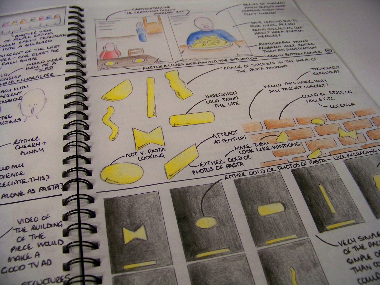
Spent the past week just coming up with some ideas for campaigns and the media which I could use to portray the campaigns etc. Had a few ideas but seem to have stuck on one, rather simple idea (which I am hoping is approved tomorrow as it would make my life lovely). Running with the unique windows of my brand as the selling point, using them across the potential campaign to create a strong recognition of the packaging and design when seen in store. Literally thinking black background, gold/pasta filled windows on. Potential tagline of 'What's your Impression?' or something along those lines (trying to include the audience and asking them which shape of the range is their favourite; I'm thinking this line is gunna need a lot of work). Very minimal, much like my lil' cylinders and I'm scared the tutors may think 'oh, what a cop out' but simple sells right? In terms of media, the simplicity of the design makes it easy for my to create adshells, billboard, an animation (for tv or web), website, promotional carrier bags and a magazine campaign. We're only meant to be doing two media but I may end up doing more to make up for the simple look. Maybe. Anyway, one of the ideas was to create a structure within an adshell which could actually hold pasta, recreating the packaging itself and creating that bit more interest. May be hard to create this across other areas of the campaign though. Anyway, here are a few sketches and pages from my sketchbook with my other ideas too (none seem quite as strong/desirable as my main idea so fingers crossed for me tomorrow guys):


Initial brainstorm
One of my messy sketch pages
Another messy page of my brain exploding

Neater ideas
Few more ideas including a concept of people not impressing as they haven't used Impression. Not the strongest of ideas...
You can kinda see what I mean with the bold and simple thing. Few ideas for outcomes
Few more media ideas


Bold and effective? Or a bit too simple? Let me know what you think, remember, it's got to reflect my brand and its values!