Showing posts with label designer. Show all posts

Designer of the Week 9: Adrian Frutiger

I blame year one, semester two of University for my huge liking of this guy. As you may have seen from my online portfolio on my website (shameful plug, www.liannamaydesign.co.uk ), our first solo brief of university life led us down the route of promoting a font for its unique qualities. And that was when I fell for Frutiger...


Ever since, I haven't been able to stop using Frutiger in my work! As a type designer, Adrian also came up with the very popular Univers, OCR-B and Avenir; all very powerful and modern sans serif typefaces. Frutiger to me feels like a refreshing change from Helvetica and I love how I'm now identifying small variations between different fonts and typefaces (probably a good thing seeing as I'm embarking upon a History of Typography module after Christmas)! Anyway, I shall leave you with this very interesting link about Adrian Frutiger whilst I get on with my Christmas shopping; http://www.linotype.com/720/adrianfrutiger.html enjoy guys!

Designer of the Week 8: Disney


My boyfriend was an absolute star last week and bought me a copy of the new remastered Beauty and the Beast on Blu Ray (giving him an excuse to play with his new toy of a blu ray player I reckon) and as well as re-living my youth, I really appreciated the detail and artwork of Disney. I'd totally forgotten about the main ballroom scene and how the cartoons are rendered upon a realistic background, making it so dream like and breath-taking. It was the second film that Disney had produced using computer animation production systems, with the first being The Rescuers Down Under (in terms of using CAPS for the entire film). This allowed the film makers to create a 3D situation in which the characters danced around in, standing out even more so in terms of being the only scene in this film where this technique was used and the significance and meaning of the scene itself.

Enough of Beauty and the Beast, I must admit I am a bigger fan of the older Disney hand-drawn films rather than the new Pixar generation. In my opinion, traditional cartoons and films are much more personal, with a lot more time and effort being put into them (especially with older films what took years to make).

Sleeping Beauty 1959
Snow White and the Seven Dwarfs 1937
Pinochio 1940
Cinderella 1950
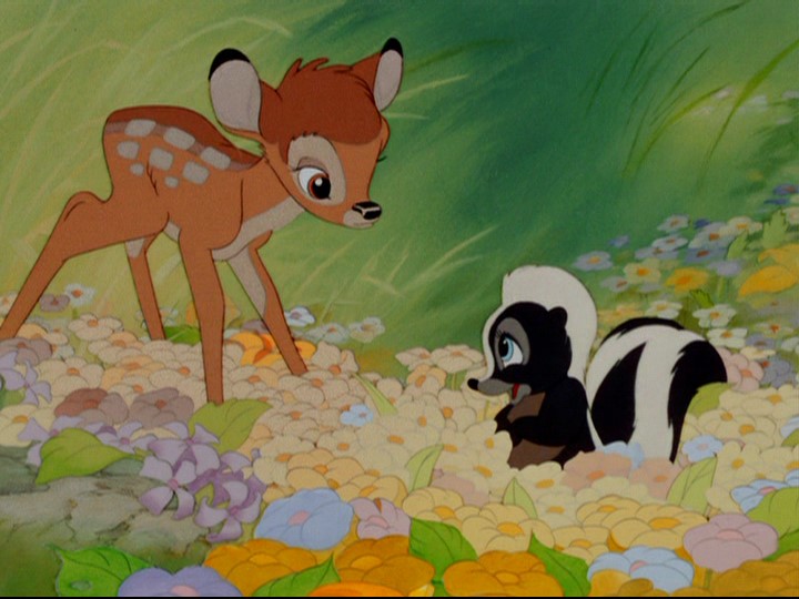
Bambi 1942

It amazes me that some of these films were made before my Nan was even born, let alone my Mum! I love how much work has gone into every frame and the detail in each film. Do any of you guys have a favourite Disney film, either traditional like those above or something from the digital age? Drop a comment below and let me know. Mine's strange, my favourite is Beauty and the Beast but my favourite Disney princess (as I'm a bit girly) is Princess Aurora. So I kind of love Sleeping Beauty too haha!

I'm off now to have a go at twisting Channel 4's words, have a go yourself!

http://twist.channel4.com/words

Designer of the Week 7: Lianna May Wragg

I know, I know, shameful plug here. I've been sat working on my pasta project all night (which I've finished but keeps wanting to crash on me as I make the file sizes smaller) so in the meantime, have a quick visit to my website, it's getting lonely!


And also keep your eyes on it over the next few weeks. There are some big changes and updates in store as soon as pasta is out of the window! Some coming on here too...

Designer of the Week 6: Antoine et Manuel

Another blast back to my A Level results here!


I absolutely adored these guys at A Level and gained much inspiration from them during my project developments as their work is so varied and exciting. Not only do the use digital media but they have created many pieces combining mark making and digital manipulation to create one-off unique pieces.
Hand rendered piece. The messy look and unstructured text really work for this piece and the experimentation with paint shows that PCs/Macs aren't the best ways of producing spectacular graphic design pieces
Wallpaper design. Even though it's extremely busy, I think I'd still have this on my walls! Or maybe just a feature wall...

My favourite piece by Antoine + Manuel, this heavily inspired one of my projects at A Level where I completely renovated the Sheffield transportation system, using this as inspiration to create a new tram map
The stark contrast between the vivid colours and greyscale imagery here is very eye-catching and impressive, a combination which I may try out in future projects

Sorry for the shorter blog tonight guys but I hope these images and link sets you off to go explore the world of French graphic design. Marketing report is finished, handed in online and to be handed in tomorrow by another team member so I'm off out now to celebrate (by watching the new Harry Potter film haha)!

Designer of the Week 5: Flight of the Conchords

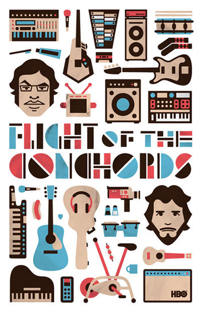
Well, in today's case it's going to be kind of a design of the week. I have spent ages searching for the artist's name and whether or not the pieces were done by an individual or various designers but anyway, today's showcase is on the art of Flight of the Conchords. In case you don't know Flight of the Conchords are a band from New Zealand, popular also for their HBO TV show. A little bit of a spoof/funny rock band, this is reflected very much so in the artwork for their series, albums and promotions. Recently, I've been falling back in love with the more hand-rendered look and the band certainly grab on to that style and run away with it.

As you can see, the band is really colourful and mad. For their recent tour, the due created a tour poster individual to each date. This piece is much more extravagant than the one I got in Manchester! 

A little different from the hand rendered look, I love the simplicity of this piece in contrast to the previous image. No corporate image seems to be kept by the band, with the sporadic nature of the designs and fluctuation in style itself becoming their corporate image
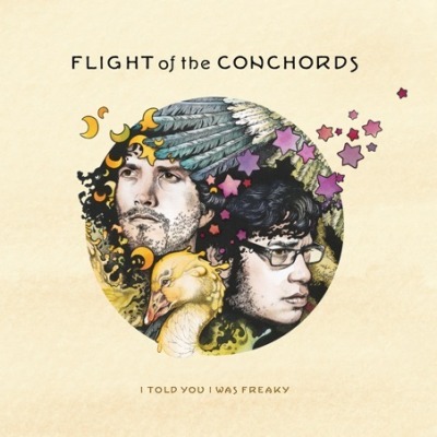
This piece, for FOTC's second album, once again uses sketches rather than pure digital artwork. Despite the sombre looks of the pair, you still can't help but laugh at the sight of a random duck on the artwork!
Above is the TV series cover for the second series of the programme. The use of the oversized heads became a trait for the series, featuring on the posters, DVDs and show titles
Their first official album on a major label once again plays around with the idea of chaotic imagery. Colours used are very vivid and I feel that everytime I look at this piece, I spot something new which I haven't seen before
Poster to coincide with TV series. Love the copy beneath and the reference. The simple lines drawings upon the baby blue background work great
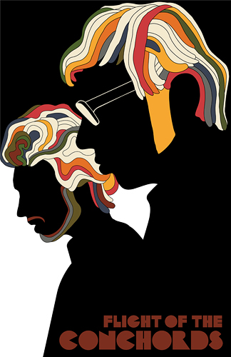
Something all you designers out there will recognise, a brilliant parody of the infamous Milton Glaser piece. It's great how you can still recognise the pair even in this get-up!


There's nothing better than design that doesn't take itself too seriously and makes you laugh and crack a smile!

Designer of the Week 4: Saul Bass

Bit of a blast from the past tonight with someone who I studied during my Graphic Design A Level. I'm not one for intricate, complicated art and this guy delivers his messages clear and simply: love him.


Although well known for his graphic design pieces and films, he is better known for his amazing movie title sequences. Collaborating during his lifetime with Alfred Hitchcock, Stanley Kubrick and Martin Scorsese, Bass' work has been featured on many films including North by Northwest, Veritgo, Psycho and his most recognisable piece, The Man with the Golden Arm.

His distinctive, hand rendered style is instantly recognisable and his limited colour palette for each piece makes them eye-catching, bold and straight to the point, a trait which I would love to bring to my own design work. Enough of the writing stuff now, here are some examples of my favourite Saul Bass pieces:


The Man with the Golden Arm poster. The amount of times I drew this at A Level was unbelievable. Although I've never seen the film (though I reckon Ii should, Frank Sinatra is in it, top guy), I love the poster for it's simplicity, hand rendered look and restricted palette.

Vertigo movie poster. Doing this is making me realise how limited my film spectrum is! Another example of Saul's restricted palette and hand drawn designs. His style is emulated across all of his work, creating an instantly recognisable range

Anatomy of a Murder poster, another infamous Bass piece

Ooo, love coming across something new, just found this piece by Bass and I think I've fallen in love. Sometimes, the best designs are simple, clear and straight to the point. Wow, I fancy going off and drawing some Saul Bass stuff now!

Friendly Friday 3 (a little late, I know haha)

Well, what can I say, last night was Bonfire Night so I might have just neglected my blog a bit (I'm sorry blog). Anyways, it's getting hard to recommend a friend every Friday as some are still establishing their blogs and sites (if you want a recommendation, drop me a comment or message btw). So, seeing as it got set up this week, I shall recommend myself for one week only (please don't see this as being big headed guys, pleaseee).


Designer of the Week 3: Jasper Goodall

It's that time of the week again guys and today, to distract me from pasta, I've had some of my fave band on full blast. Nothing like some Muse to cheer up your day. And it got me thinking, especially when flicking through their single and album artwork on my iTunes; I haven't showcased one of my fave Muse single artwork designers yet!


You might have seen my own interpretation of Jasper's Muse cover on my website (if not, I wouldn't suggest looking at it after viewing his, it puts mine to shame!). His cover art for the CD/DVD/Vinyl version of Muse's single 'Invincible' brought Goodall to my attention (I love how music influences you sometimes) and then I realised he'd done most of the single artwork for the Black Holes and Revelations album!
Example of Goodall's smoke imagery which Muse used for their Wembley tour dates in 2008
Starlight single cover, sticking with the recognisable Goodall style

Invincible single artwork. I adore Goodall's smoke imagery and I understand how time consuming it must have been after recreating my own (see liannamaydesign.co.uk, personal work section)
Supermassive Black Hole single artwork
Knights of Cydonia single artwork, another example of Goodall's smoke imagery

Obviously the guy does more than just work for Muse! Quite alot of his work is dominated by the female form (on many occasions, a naked form) which he believes is influenced by his father's photography work of the 70s of the feminist movement. The illustrations are so intricate and delicate, something which drew me further into the work of Jasper and the vivid colours contrasting his theme of strong black and white create a dramatic and eye-catching effect. Below are a few more examples (which aren't to do with Muse ha):

Don't know about you guys but I get a real Bond Girl/Bond Titles theme from this. Think Goodall would make an amazing job creating the next Bond film titles. Made from pieces that weren't use during his Muse brief
Love the limited use of bright colours on this piece, contrasting the stark black and white
Have a look at the dude, his work is amazing! It's pj time and potentially pasta for me now!

Designer of the Week 2: Takashi Murakami

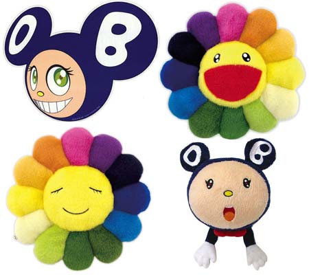
Here's something a little different to my normal taste but has stuck in my head for years. A while back, I was watching an art programme on BBC2 (don't ask me the name, I can't remember for the life of me and neither can Google) and it featured a section on the Japanese artist


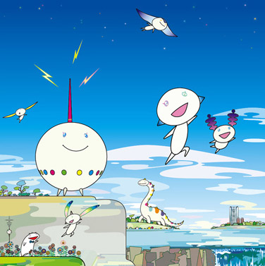
Now, I'm not normally a big fan of the whole anime/graphic arts scene but after watching the show, I really fell in love with this guy and his work. Not only does he work in digital design, he expands his work in fine art and sculpture in which he's developed his own style: Superflat. Being a bit of a day dreamer, his use of bright colours, rainbows and smiling characters is really up my street! His merge of modern Japanese art styles with the works of the infamous pop artists such as Andy Warhol and Roy Lichtenstein is ingenious (something which I believe drew me to him due to my love of the pop art era). Anyway, enough of me talking about the guy, here's some of my favourite images!

A lot of Murakami's work has been made in to toys and teddy bears. I love the ones above, especially the flowers due to how upbeat and bright they are

Digital version of the flowers, a design which is so popular, it has even been made into wallpaper (something which I would die for!)


I love how cute and colourful all his work is! Design doesn't always have to be serious and complicated and I love how his designs are always simple and sweet

If I'm honest, I've kept one of his more famous pieces from you. Personally, I'm not a fan of his music but I still love this album cover:

Anyone who's a Kanye West fan will have probably seen this Murakami album cover design

Check Murakami out, his work never seems to fail to cheer me up and inspire. I'm off to be with pasta now. Or try and recreate my own Murakami inspired piece!

Friendly Friday

Well guys, it's been almost a week since my little blog here was born and viewing figures are great! As you've seen, I've established the weekly days of Crit Tuesday, Advert of the Week and Designer of the Week so here's another...Friendly Friday. As I'm such as nice lass, each Friday I shall recommend a fellow designer friend for you lot to check out (and trust me, if they're on here, they're good, I tend to be very picky!). I urge you to check out whoever I post and be friendly!

Enough of the chit chat, this week I'm showcasing my good friend Michael Pasquale


[WARNING: this guy is extremely hilarious, you will definitely get some good laughs out of this blog]

His work is fantastic and his comedy really comes across in his illustrations (which have on many occasions got us through boring lectures). For the ladies out there, this Italian Stallion is single as well as being a whizz on a Mac (what more would a girl want!?). Please check him out, I've purposely not posted images so your curiosity takes you to his sites (master plan or what!), he's a great guy, reliable designer and a good friend of mine.


Designer of the Week: Alessandro Pautasso

As you guys know, I've been sent a tester photo to edit for a photography in hopes of getting a job as his graphic designer side kick (that aint the job title, I'll just refer to myself as that as it sounds pretty cool). Anyways, he has given me total free reign of the photo (which I may eventually get on here with my final designs, need to ask his permission first) so I have been racking my brains for inspiration. Here's where my designer of the week comes in.


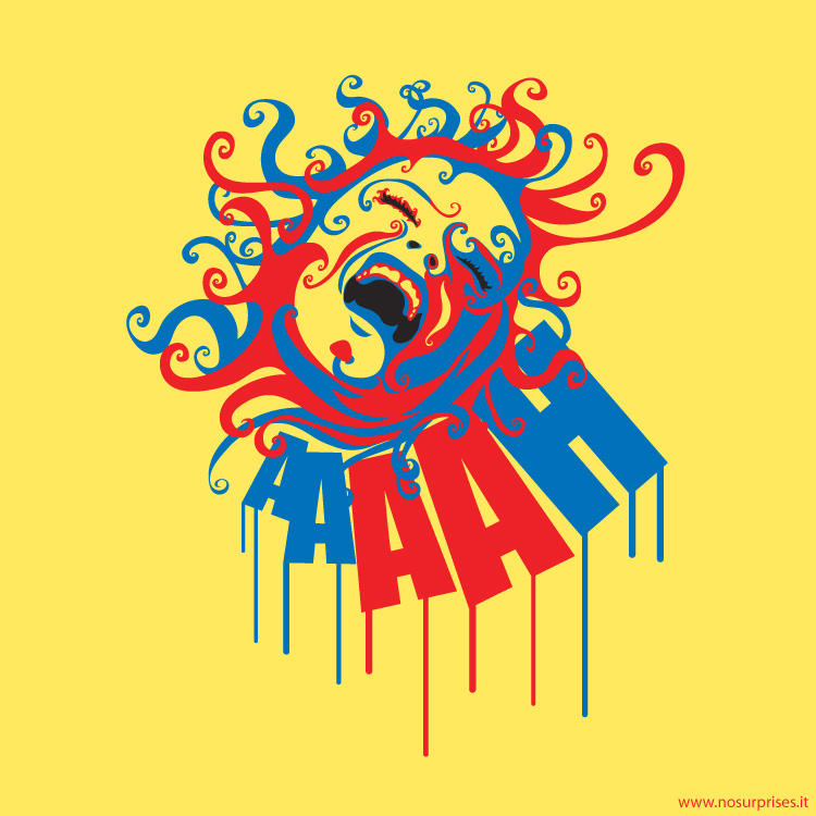
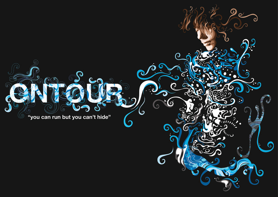
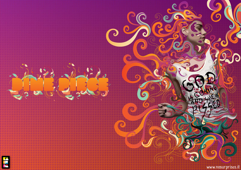
Came across the Italian designers work whilst trailing through Google images and Flickr and was extremely impressed. I love the use of bright colours and feminine imagery, all processed using Adobe Illustrator. Despite all the images looking different from one another, with some faces created via illustration and some via photography, a strong, corporate colour scheme is used throughout which allows each piece to be identified as part of Alessandro's series.


The pieces towards the end are what I hope to use to inspire my photo edit. I've been playing around with many different design ideas, none of which have been successful...yet. Hopefully this technique will work with the rather simplistic side profile I've been given! Another idea I'm currently running with is mirror effects, much like the alternative artwork for the Kings Of Leon 'Because of the Times' album so I'll keep you all updated on that in due course. In the meantime, check out Alessandro, his work is fantastic and has really given me a much need inspiration boost!