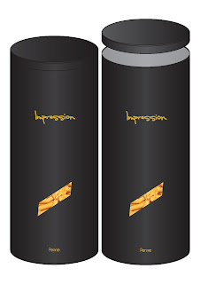
It's been another day of pasta in the Lianna household. Had a day off from designing yesterday which resulted in an A&E trip so I'm getting my head down on this loooong Sunday. As I mentioned in my Crit Day blog entry, I'm still running with Impression as a name and aiming at the average pasta user who wants a premium look (to impress, see, it fits!) at a cheap price, with the added convenience of a portion measurer. Still working on the design but I thought I'd give you a quick glimpse at what I'm currently working on...
[I know that the text isn't in perspective on the rounded cylinder but that's my next job hehe]
Anyway, I'm not sure whether I like this or not. Spent this week working on layouts and colours and this is what I've come up with. I'm hoping that the font still makes the product look posh yet still approachable for the average mom shopping in a supermarket etc. What do you reckon? Moved the window 3/4 down as the class said and I kinda like it, balances out well with the logo 3/4 up. Speaking of the logo, do you think a purely text logo is enough or should I add more ie a symbol etc? Toyed around with the idea of making the handwritten text look like chalk to go along with the menu boards at restaurants but my good friend (see my Friendly Friday blog) suggested it might lower the tone, especially when I originally settled on gold. After quite a bit of deliberation, I decided in the end to add the pasta name at the bottom really tiny, didn't really take away from the minimal design and it informs the audience should they not make the connection with the window shape. Settled on a black lid too rather than a differing colour, didn't want it to look cheap.
Could you guys imagine seeing this as a believable product on the shelves? Does it look too high end that a working mom wouldn't buy it for example?
Obviously I've still got quite a bit of work to do on it so I better get on with it and stop rambling to everyone on here!


No comments:
Post a Comment