Showing posts with label logo design. Show all posts

Designer of the Week 10: Well, logo design in general!

Found a spare few moments in between revising today to have a little gander of the internet and I came across this pretty cool site:


I really like the world of logos and branding and found myself enjoying the process immensely during my pasta brief. I've ended up spending a while on that site searching for logos old and new and appreciating the various vector illustrations both known and unknown companies use in order to represent them. Below are a few of my faves: 

New Look
UK Clothing company

Love this piece for it's use of it's personal, minimal text and amount of white displayed. The effect of spot colouring draws in the eyes and reflects the girly clothing of the company well


FedEx
Delivery company

Although not an amazingly exciting logo on the offset, I have been amazed ever since a lecturer in my first year pointed out the deliberate arrow shape created between the 'e' and the 'x', emphasising the fast, straight forward delivery services offered by the company


Muse
Band logo

As my fave band of all time, you all knew it wouldn't take long for their logo to appear on here didn't you! The pure simplicity of this works so well, something which when I first saw the piece created an air of mystery of what it was all about and led me to Google them. The design translates well into different designs and colours which has been of great use to the band in terms of promotional material and merchandise


Batman
Franchise logo

Although I'm only really a fan of the later Batman films, the use of the same logo across the original comics to the Hollywood blockbusters has created an iconic logo, recognised by practically everyone. Even when not in full colour, the use of the one image of a bat is automatically associated with Batman, with no words even needed

A potential change in direction?

Like a nugget, I was up until 5am this morning pondering over a new direction in branding 'me' as a designer. As you all know, I've run this blog and the corresponding website, Twitter and forums for a while now but I'm starting to feel they're a little boring, especially when it comes to presenting them in my fifteen page booklet. I uploaded a couple of snippets yesterday and got some lovely feedback via Facebook so I've decided to upload some better quality images for you guys to have a look at and let me know what you think. As a person, I'm really colourful and energetic and I'm starting to lean a little more towards my new design to represent and project this. However, the new design to me feels like I've seen it before. Anyway, enough of me rambling on and on, here are the images; let me know what you reckon!


Current website design, very plain and simple but I'm only really liking the homepage, the others seem really boring

Apologies for the poor screenshot, not created a particular layout here, just exampling a potential new logo and colour scheme? Can you read the logo?

Crit Tuesday 6

GOOD DAY! Had some really positive feedback today on both my magazine spread and adshell designs. So good that the only suggested improvement to be made was to potentially make the fonts a little larger so people can see them easily from the associated distances. Yay! I was expecting a need in changing the copy but Jim and the gang seemed to really like my tagline and concept and nothing was mentioned about the small copy at the bottom of the magazine pages so I presume that sounded ok! Printing meant the packaging examples on the magazine pages didn't show up very well so I shall have to get that sorted but other than that, all is good! In other Lianna news, the group marketing report is pretty much finished! We're aiming to print it and hand it in tomorrow before the Thursday deadline. Hopefully our content and outcomes go down well when being marked! Once that's in, it seems to be plain sailing, with the pasta project and illustrator workbook in before Christmas and my marketing exam and online self promotion coursework in after. I say plain sailing...ha!

Thought I'd share this with you guys aswell, caught a glimpse of it earlier:


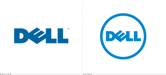
Dell have a new logo! Having 700 creative agencies working for them got a little confusing, with their logo being slightly different and varying slightly in typefaces used etc. To solve this, they've created one single logo (very similar to the original) which will be used across the board an coloured in 'Dell Blue', a colour not available in any colour book. I really like it, ties in nicely with the circular designs they have on their products. Plus I love Dell, my beast of a graphics PC (I know, I know, I should be loving Macs but you've seen previously blog entries by now ha ha)!

It's been a bit manic to say it's a Monday!

After my blog entry yesterday, I ended up on a very productive spin and really got my name out there! I joined a couple of design forums, finally uploaded things onto Flickr, began sorting out my website, made a couple of logos, blah blah blah! And WOW did I get some results. I had literally been on the forums for half an hour and I already had over ten replies and helpful comments, my Twitter went mad with new followers and this blog, even though it's only just started, went from 3 or 4 fews to almost 40 in one hour! As they say in Yorkshire, I was dead chuffed! Even more exciting was a post I noticed from a photographer up Newcastle way who required a graphic designers help. I thought 'o yeah, al av a go pushin me luck whilst I'm on a roll' (yep, I have a very broad Yorkshire accent) so I dropped him an email about his request for a designer to edit all his photos for him. Went to bed and didn't think nothing more on it until I checked my emails this morning...HE'D REPLIED! He said he'd looked at my work and was very impressed and wanted to know if I was willing to edit a tester piece for him before we went serious (I talk about this as if it's a romance haha, kinda feels like it at the minute!). So yeah, good mood today despite the masses of work I have to do. Whilst I'm waiting for a reply, please head over to his site and check him out:


and keep your fingers and toes crossed for me on that one :) Anyway, onto other things...

As I said before, I've been creating a few types of logos for my self branding task. I ended up sat doodling in my marketing lecture this morning and came up with a design that was simple yet memorable and captures the essence of my design brand (clean cut, modern designs, efficient etc). Decided to colour co-ordinate logo to the applicable site they are to be assigned to, with hopefully this reflected on my website in links such as liannamay|twitter in the associated colour for example. What do you reckon?


And I'm thinking this for my main website logo? Too girly? Boring? Crit me :)

I'm off now, I've rushed through my pasta sketches today so I've got more time to research establishing a website/getting a domain name etc. Crit day tomorrow so my mood may have changed by the next time I blog...