Apologies

Really sorry guys about my lack of contribution to my blog as of late. Not been well at all recently but hopefully that will soon be sorted with a trip to the doctors next week. I promise I'll eventually be back on my feet and posting on here soon! In the meantime, here's a great advert what's been cheering me up immensely recently, I'm so glad it's back on TV:


And if you haven't done so already, the company have set up a great memorable way to remember the advert by including your face in it! I did some the other day, the outcomes are hilarious!


Hopefully be back to fully functioning blog soon, wish me luck with the doctors!

So it's Sunday 11...

Just quickly checking in! Had a mega busy week of moving house and decorating etc so I haven't had the time to keep you guys up to date with my antics, I apologise. Love our new house and the painting I managed to get done before coming back up to Leeds. Nothing better than being back home in Sheffield for a while, especially being able to overdose on Henderson's Relish, the hidden treasure of Sheff!

Happy 2000 Views!

After checking my stats and seeing the frustrating figure of 1999 views since my blog opened at the end of October 2010, I've just clocked up my 2000th after encouraging my fiance to click on it! Exam time tomorrow so I won't ramble on here for too long. Spent the past few days being the film buff that I am and watched several, out-of-my-comfort-zone films which I ended up really enjoying. My favourite in particular was 'Rules of Attraction'; an extremely weird film which often played backwards (which really made me feel strange watching it, especially with all the backwards music) and used clever camera angles and shots to convey the story. A film I'll definitely have to watch again, the chronology jumps all over the place and it switches often from speech to inner monologue and alternative experiences. Not really one for the faint hearted chick flick lover (which I tend to be to be honest) or for those who like a definitive, answered ending but I'd recommend giving it a try! I feel I need to read the book it's based on too now!

The film's really awesome promo poster
I also learnt a valuable lifelong lesson today: when you have new blue sheets, give em a wash before you sleep in them or you will wake up blue and look like a Smurf!

Advert of the Week 12: Thinkbox

Relaunched last Christmas, I really love this advert, advertising, well, adverts! Helps that I'm a huge dog lover too! The piece won Advert of the Year 2010.


I love this advert too, Thinkbox's previous campaign (their first crack at TV advertising for their own brand). I end up singing along to practically all of these songs, really does show the power of advertising.

Designer of the Week 10: Well, logo design in general!

Found a spare few moments in between revising today to have a little gander of the internet and I came across this pretty cool site:


I really like the world of logos and branding and found myself enjoying the process immensely during my pasta brief. I've ended up spending a while on that site searching for logos old and new and appreciating the various vector illustrations both known and unknown companies use in order to represent them. Below are a few of my faves: 

New Look
UK Clothing company

Love this piece for it's use of it's personal, minimal text and amount of white displayed. The effect of spot colouring draws in the eyes and reflects the girly clothing of the company well


FedEx
Delivery company

Although not an amazingly exciting logo on the offset, I have been amazed ever since a lecturer in my first year pointed out the deliberate arrow shape created between the 'e' and the 'x', emphasising the fast, straight forward delivery services offered by the company


Muse
Band logo

As my fave band of all time, you all knew it wouldn't take long for their logo to appear on here didn't you! The pure simplicity of this works so well, something which when I first saw the piece created an air of mystery of what it was all about and led me to Google them. The design translates well into different designs and colours which has been of great use to the band in terms of promotional material and merchandise


Batman
Franchise logo

Although I'm only really a fan of the later Batman films, the use of the same logo across the original comics to the Hollywood blockbusters has created an iconic logo, recognised by practically everyone. Even when not in full colour, the use of the one image of a bat is automatically associated with Batman, with no words even needed

So it's Sunday 10...

During my rather unrelaxing weekend of getting ready to move/return to Leeds/revise, I found the time to sit down for five minutes and have a little gander through a couple of newspapers when a photography article caught my eye (with the images featured especially gaining my attention). As a huge fan of countdowns and competitions, I enjoyed reading about Digital Camera Magazine's Photographer of the Year 2010 competition and having a look at the overall winner and other subcategory successes. Really made me realise that not only photography skill is involved but also the ability to seek out and capture a particular moment, with some involving skill and time and others created merely via luck. Below is a link to the competition page and a few of my particular favourite entries which perked me up during a time of burst pipes, decorating ideas and houses that lack electrcitiy!


Overall competition winner, Jon Wright with his piece 'Exit Wave'. Really stunning piece which took me away from my winter blues and this miserable whether we've been having recently

Fire Fighter by Buchachon Petthanya. This was the piece what really dragged my attention to the article in the newspaper, coming second to the overall winner in the adrenaline category. Unbelievable how he managed to capture this piece and highlights a photographer potentially putting his life in danger for his art

This piece, 'Jump', by Wayne Lawes was unbelievably achieved in one shot, taken for the photographers own entertainment and for the dancer's portfolio. To say it portrays such a strong and powerful man, it conveys a great sense of elegance and beauty at the same time. Wish my camera was waterproof!

Even though this image wasn't shortlisted in the competition and only commended, I found myself really drawn to it whilst looking through the entries. As a person who loves to shoot water, as seen with my hydrophobia work, I love the shifts in focus on this piece, with some droplets blurred and others not. Seems a bit magical!
Hope you guys enjoy following the link and picking out your own favourite photos, let me know which ones you liked and what you reckon to my favourites! I may have to upgrade my camera sometime soon so I can try and achieve some of the detail captured in the images above!

It's all on the move here in Sheffield

Well, I was rather shocked when I opened my curtains this morning! Snow again, and lots of it! Not that I'm moaning, I love the stuff and having the excuse to wear my silly wellies! In other news, we got the keys to our new family home here today so I took up the opportunity to pick up my camera and have a nosey in the garden at all the lovely snow as a break from revision (note: the quality of some of these photos is a little off as I didn't realise that the windows I were taking them through were mucky until I left haha).

I tend to have a thing for capturing water and water droplets, especially after my Hydrophobia brief (see http://www.liannamaydesign.co.uk/). At the time, sadly the falling snow had turned to rain


Peg love! Whilst inspecting our new back garden, I found these two having a little peg hug. The cutey girliness inside of me is reflected in the image, bless!


Taken through a mucky window like a nugget but kind of like the grainy effect achieved

Milk Bottles

Not the best pictures I've ever taken but it was nice to be running around with my camera again, first time in a while, especially seeing as Photography 2 module starts when I return to uni!

Advert of the Week 11: Volvo

Back to the routine of my normal blogposts from now on seeing as Christmas is over! You'll have to forgive me if I miss a blog entry here and there are it is rather hectic here in Sheffield at the moment; I'm cramming in some revision for my exam on the 18th but also we're moving house so there are endless amounts of boxes and things to be packed around our home. Plus I have to get my things packed to get back to Leeds, eek! Anyways, enough of me rambling about my personal life and times, here is my advert of the week (I apologise that there's been a few this week but New Year has provided TV with some great new adverts, excluding DFS and their never ending sale mind haha).


(You wouldn't believe how long it took me to find that ad)

As someone who is totally car illiterate, I don't tend to pay attention to their advertisements. They all seem to be slow mo and elegant blah blah. It was for those reasons why this one caught my eye. There's nothing funnier than something that is willing to take the mickey out of itself. I love how it deconstructs all other car adverts in 30 seconds in terms of how you make them. The black backgrounds, red text and sexy music and reminiscent of the stereotypical car advert and without the slides of text, it really would seem like just another car advert. It's those little sections which make you want to wait around and watch the advert again to make sure you actually read it (well, I did haha).

Fruit! Ahhhh!

I know I've recently been tormenting you all with my current favourite TV advertisements (though my figures and stats seem to be showing you all like it); here's another one which caught my eye today!

http://www.youtube.com/watch?v=x_HMrOd2_QI

(Sadly it's so new Innocent Smoothies haven't included an embedding option yet)

Please have a visit. Excellent parody of the Queen song, the tacky use of sticks are wires to hold the bottle work brilliantly and overall, it's a really good giggle! What more do you want from a TV advert, certainly made me remember it!

Happy New Year Guys!

Hope everyone had a great New Years! Sadly now all the fun is over and it's back to the grind. The grind for me being designing, so not much of a grind! As I told you before Christmas, I have one project due in on the 10th and an exam on the 18th. Well, luckily due to my overactive desire to work, I literally have one bit of a page to finish and a 500 word report to complete for the project so if it isn't sent off tonight, I'll be doing so tomorrow which will be nice! After I've sent it off, I'll hopefully upload a few images on here for you guys to have a gander through (though not many, the proposed minimum of 15 pages has somehow changed into 19 or so in my case, oops!).

Anyway, enough of me rambling about my work, here's the real reason why I'm back on here (even though it isn't even advertisement of the week time). I'm sure you've all noticed the increase in adverts on TV, showcasing New Year sales, holidays and insurance, as is always the case in the New Year (I'm not even going to mention weight loss adverts ha). One which I literally saw for the first time literally ten minutes ago and felt the need to pop on here and share was the new Virgin Airlines advert. All I can say is pure genius once again!


I've got to admit, as one of the biggest Muse fans you'll ever know (trust me on that, I've become a serious traveller following them to their gigs), it was the song what originally pulled my head up from my laptop screen to look at the TV. I love how this new advert has the Bond titles sort of feel and the colours used really does make you feel like going on holiday! The final line also gave me a giggle, I love the juxtaposition of the classy and flash advert with the localised accent at the end. I've got to admit, I've been a big fan of Virgin adverts for a while now, enjoying their retro feel and how they have gone back to the routes of their airline (including the burlesque advert featuring a woman displaying circular cards with the offers on to cover her private areas, very risque!). Below is another Virgin advert from last year (for their 25th anniversary) which I also really enjoyed for its retro feel, use of brilliant song and overall great piece. Bravo Virgin!

Those few days you spend in limbo (Advert of the Week 10: Plusnet)

Argh, there's nothing worse in my opinion than the few days between Christmas and New Years. Blues start kicking in, TV gets full of repeats and there's a few days until something to look forward to! However, in this mini entry/mini advert of the week piece, I shall show you what has really been cheering me up and making me giggle now that Christmas is over and work is slowly starting to creep back into everyone's lives...


It makes me want to get Plusnet and so proud of being from Yorkshire (in particular the sunny Sheffield which the company is based in). The company have been really going for it recently with their advertising, placing catchy slogans in the Yorkshire lingo around Sheffield (not sure whether it's reached anywhere else or if it's localised to Yorkshire) and I love it! There's nothing better than reading something the way you say it! I'll not want to leave home when term time starts again with this ads flying around everywhere ha!

Anyway, enough of me bleeting on about Sheffield, if I'm not reporting back on here in the meantime, I hope everyone has a great New Years and doesn't spend it dancing like a nugget to Heaven 17 like me!

Ok, so maybe one more before Christmas!

You all secretly knew I'd be back on here, I can't seem to get enough of the place! Anyway, I thought I'd let you know that my CV and past three months worth of newsletters are now live and available to download at www.liannamaydesign.co.uk/downloads yay! I apologise for it taking quite a while but they're there now, call it an early Christmas pressie. Somehow I've had around 10 downloads of each file today so if you have been one of the lucky ten, please let me know what you reckon to them and if you have any constructive feedback to give me. I know they are rather simple but that is the look I am trying to aim for; bold, corporate and modern with the small twist of flashes of bright colours and quirky language which represents who I am as a person. Once again, I've been working on the pdf booklet today for our Online Promotions brief and with each page I do, I tend to add another to the minimum of 15. So far I have finished around 9 pages and you make think 'wow, nearly done'. No way. I've ended up with around 7 final outcomes due to the expansion of my online presence (website, blog, Twitter, forums, flickr, tumblr, cv download, newsletter download) so now I feel the need to create development pages for them all properly. At the moment, I'm estimating that I'll finish up with around 20 pages (including the reflective report, not including contents and cover) which is scaring me. Anyway, in order to get a bit of feedback, I thought I'd post a few of my completed pages on here for all to have a gander at. Once again, very simple and following formal grid structures. Finding it very hard to achieve high quality print screens which I might have to deal with again later (has anyone else been having this trouble?). Just hope they aren't seen as boring and given a bad grade!

Website Portfolio presentation page

Blog presentation page

Twitter presentation page

CV download presentation page

Newsletter download presentation page

Forum Participation presentation page

Others (Flickr and Tumblr) presentation page

Signing off for Christmas!

Hey guys! Just thought I'd give you all one last blog entry before I leave you all to enjoy your Christmas (and so I can enjoy mine haha)!

Lack of entries lately have been due to moving back home for the holidays and several nights late night shopping to get those last few presents (I cannot believe that Meadowhall is open till midnight, crazy stuff). Currently (as usual) stressing about things I've got to do, this time being finishing my online promotion work (luckily all the online things are done, I'm just part way through constructing the booklet) and revising for my marketing exam (which I have yet to begin, oops). In the end, I decided to run with the theme already displayed on here and on my web page, with simplicity and minimalism being 'my thing'. Currently constructing my booklet and CV (gulp) in the same way but at the minute I'm worried they don't look 'designer'-ish enough. Will hopefully post them up on here if I have time amongst the mass chocolate consuming and turkey eating.

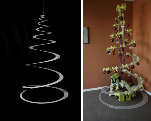
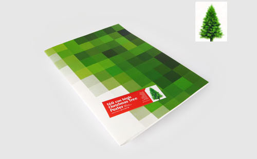
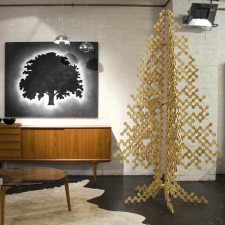
Ended up having a little explore of Google whilst writing this blog and came across many different variations of Christmas trees in the 'modern' sense, here's what I found;


Spiral cut suspended tree


Christmas tree poster as an alternative to the real thing

Another alternative tree, bare and minimal

See, to me, all the above trees seem very innovative in terms of their design and look and yes, they do go along with the modern trend, but is it just me who feels they seem a little cold and lack the festive spirit? The idea of replacing a tree with a poster seems to extreme to me and even though I love minimal designs and simplicity, there is a point where people need to stop, especially with a Christmas tree! I just seem to love the tacky lights, tinsel and bauble idea and would much rather have the following in my home during the season to be jolly;


Ours at home is a little more wonky and uncivillised compared to this but isn't that what Christmas is all about?!

Anyways, enough of me rambling! I should be back on here between Christmas and New Years with further updates about the life, times and designs of me so in the meantime, everyone have a great Christmas!

Advert of the Week 9: I can't believe I'm saying this.....The Beatles


I've kind of shocked myself since this advert has been on with liking it (I'm not a huge fan of The Beatles...ok I really don't like them, please don't hate me)! Recently, the band's entire back catalogue have finally been uploaded and made available on iTunes, something which I automatically assumed has been done ages ago. Anyway, I've ended up really enjoying the set of four adverts, each to a different and notable Beatles song, promoting this. The one above to 'Let It Be', the song I can stand the most of the four (and end up singing along to but shhh), is played against the same slideshow of images of the band in their prime. The black and white photos are stunning and the content of each is real and raw, much like the music making of the band themselves. The simplicity of this also struck me, with no fancy use of CGI or special effects, just a nicely timed reel of images to an iconic track. Another thing which I really liked about these adverts is the lack of need to even mention the band's name, with the photographs of the members being instantly recognisable without plastering logos and writing around. Merely a strap line at the end states 'Now on iTunes', allowing the viewer to discover the point of the advertisement whilst leaving you with a sense of curiosity to go on there and find out more (something which would have been diminished should tracks and albums have been reeled off). The piece closes on an image of John and Paul during their happy period (as I've been told my boyfriend who adores them), with the Apple logo hovering over the top. All in all, despite my preferences in music, no one can doubt the influence of The Beatles and their recognisable tracks and I feel this ad has been beautifully done in a poignant and sophisticated manner to honour their memory and long-lasting reign in the music world.

Designer of the Week 9: Adrian Frutiger

I blame year one, semester two of University for my huge liking of this guy. As you may have seen from my online portfolio on my website (shameful plug, www.liannamaydesign.co.uk ), our first solo brief of university life led us down the route of promoting a font for its unique qualities. And that was when I fell for Frutiger...


Ever since, I haven't been able to stop using Frutiger in my work! As a type designer, Adrian also came up with the very popular Univers, OCR-B and Avenir; all very powerful and modern sans serif typefaces. Frutiger to me feels like a refreshing change from Helvetica and I love how I'm now identifying small variations between different fonts and typefaces (probably a good thing seeing as I'm embarking upon a History of Typography module after Christmas)! Anyway, I shall leave you with this very interesting link about Adrian Frutiger whilst I get on with my Christmas shopping; http://www.linotype.com/720/adrianfrutiger.html enjoy guys!

A potential change in direction?

Like a nugget, I was up until 5am this morning pondering over a new direction in branding 'me' as a designer. As you all know, I've run this blog and the corresponding website, Twitter and forums for a while now but I'm starting to feel they're a little boring, especially when it comes to presenting them in my fifteen page booklet. I uploaded a couple of snippets yesterday and got some lovely feedback via Facebook so I've decided to upload some better quality images for you guys to have a look at and let me know what you think. As a person, I'm really colourful and energetic and I'm starting to lean a little more towards my new design to represent and project this. However, the new design to me feels like I've seen it before. Anyway, enough of me rambling on and on, here are the images; let me know what you reckon!

Current website design, very plain and simple but I'm only really liking the homepage, the others seem really boring

Apologies for the poor screenshot, not created a particular layout here, just exampling a potential new logo and colour scheme? Can you read the logo?

Pondering...

I know, I know, I should be having a short break before getting back on the working bandwagon but I've ended up stressing over my online promotions project tonight (what can I say? I like to be extremely efficient haha). Anyways, I've been looking at some layouts and griding bits and bobs up for my 15 page booklet but feel I'm stuck between a rock and a hard place in making it interesting and innovating rather than a mundane 'I love Helvetica' graphic design piece. Also contemplating totally revamping my website with new logos and layouts and everything as I've got myself under the idea that currently, it is rather boring (although the new things I keep coming up with also seem a bit generic). Another issue I'm having it matching my design booklet to the website/logos etc. Do I have to do this you reckon? Is anyone else doing it? I feel like I should but when put together, I start not liking my website as it restricts booklet designs. I need to stop moaning haha! Anyone fancy dropping me a few comments/ideas/inspiration? Would be very much appreciated!


Kinda hard to see as there's no border. What do you reckon to the layout and logo? Boring? Argh!

Another example page from my current website design

A new little idea for a logo but I feel like I've seen it hundreds of times before and I don't really think it's me :/

(there's a little link if you fancy popping over there, having a look and giving me a hand...please?)

In other news, I've decided if all else fails in the world of graphic design/teaching for me, I shall become a cook. I made a mean Christmas dinner today, amazing when I don't even eat veg and had to cook tonnes!

Ooo, whilst I remember, has anyone seen the new Andrex puppies advertisement (which has conveniently just come on TV as I typed that, creepy!)?


Is it just me who doesn't like the new CGI puppies?! Bring back the real, cute ones please Andrex!


So it's Sunday 9...

Haven't really got anything to be showing you guys now the first semester is over! Have yet to start writing up my online project but I have till after Christmas so I'm taking a well deserved break! I do have something exciting to tell you about...


...I saw Gok Wan yesterday! His fashion Fix programme was filming in Leeds and I went along to it with my sister and wow, he's ever so lovely! Ignoring the huge delays and re shoots, the show itself was fantastic and that's coming from someone who isn't generally 'with it' in terms of the fashion world. They didn't tell us exactly what the four themes were but they seemed to be some sort of neon (you could kinda tell which was designer and which was Gok and I must say, designer won for me here, she wore a gorgeous red pencil dress in comparison to red leather trousers and a green coat), angelic (again, designer was better, the cut of the dress was gorgeous and just floated on the model), winter (designer looked nicer but I personally would have worn the high street one) and geisha (although designer was lovely, Gok put together a huge sparkly number which had me as soon as I saw it!). Despite still feeling ill, I had a great day, something which I didn't expect as a fashion lacking graphic designer!

Advert of the Week 8: Florence and the Machine/Littlewoods

Well, it's not really an advert to be honest but a really cute way to expose a bit of Dog Days!


In the meantime, here's a real advert what I've been really enjoying during this festive season (although the film which the song comes from is petrifying!)


I absolutely LOVE the scene in this extended version where the shadow hand lifts up the woman (watch it to see what I mean hehe)

Designer of the Week 8: Disney


My boyfriend was an absolute star last week and bought me a copy of the new remastered Beauty and the Beast on Blu Ray (giving him an excuse to play with his new toy of a blu ray player I reckon) and as well as re-living my youth, I really appreciated the detail and artwork of Disney. I'd totally forgotten about the main ballroom scene and how the cartoons are rendered upon a realistic background, making it so dream like and breath-taking. It was the second film that Disney had produced using computer animation production systems, with the first being The Rescuers Down Under (in terms of using CAPS for the entire film). This allowed the film makers to create a 3D situation in which the characters danced around in, standing out even more so in terms of being the only scene in this film where this technique was used and the significance and meaning of the scene itself.

Enough of Beauty and the Beast, I must admit I am a bigger fan of the older Disney hand-drawn films rather than the new Pixar generation. In my opinion, traditional cartoons and films are much more personal, with a lot more time and effort being put into them (especially with older films what took years to make).

Sleeping Beauty 1959
Snow White and the Seven Dwarfs 1937
Pinochio 1940
Cinderella 1950
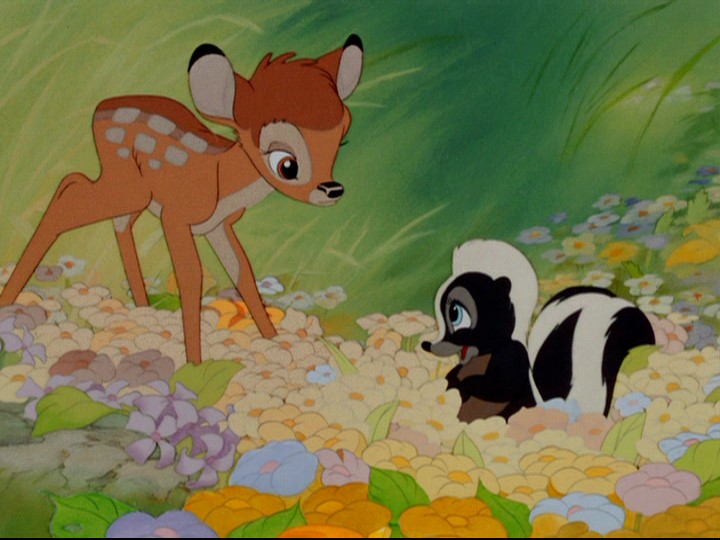
Bambi 1942

It amazes me that some of these films were made before my Nan was even born, let alone my Mum! I love how much work has gone into every frame and the detail in each film. Do any of you guys have a favourite Disney film, either traditional like those above or something from the digital age? Drop a comment below and let me know. Mine's strange, my favourite is Beauty and the Beast but my favourite Disney princess (as I'm a bit girly) is Princess Aurora. So I kind of love Sleeping Beauty too haha!

I'm off now to have a go at twisting Channel 4's words, have a go yourself!

http://twist.channel4.com/words