Argh, there's nothing worse in my opinion than the few days between Christmas and New Years. Blues start kicking in, TV gets full of repeats and there's a few days until something to look forward to! However, in this mini entry/mini advert of the week piece, I shall show you what has really been cheering me up and making me giggle now that Christmas is over and work is slowly starting to creep back into everyone's lives...
It makes me want to get Plusnet and so proud of being from Yorkshire (in particular the sunny Sheffield which the company is based in). The company have been really going for it recently with their advertising, placing catchy slogans in the Yorkshire lingo around Sheffield (not sure whether it's reached anywhere else or if it's localised to Yorkshire) and I love it! There's nothing better than reading something the way you say it! I'll not want to leave home when term time starts again with this ads flying around everywhere ha!
Anyway, enough of me bleeting on about Sheffield, if I'm not reporting back on here in the meantime, I hope everyone has a great New Years and doesn't spend it dancing like a nugget to Heaven 17 like me!


Ok, so maybe one more before Christmas!
You all secretly knew I'd be back on here, I can't seem to get enough of the place! Anyway, I thought I'd let you know that my CV and past three months worth of newsletters are now live and available to download at www.liannamaydesign.co.uk/downloads yay! I apologise for it taking quite a while but they're there now, call it an early Christmas pressie. Somehow I've had around 10 downloads of each file today so if you have been one of the lucky ten, please let me know what you reckon to them and if you have any constructive feedback to give me. I know they are rather simple but that is the look I am trying to aim for; bold, corporate and modern with the small twist of flashes of bright colours and quirky language which represents who I am as a person. Once again, I've been working on the pdf booklet today for our Online Promotions brief and with each page I do, I tend to add another to the minimum of 15. So far I have finished around 9 pages and you make think 'wow, nearly done'. No way. I've ended up with around 7 final outcomes due to the expansion of my online presence (website, blog, Twitter, forums, flickr, tumblr, cv download, newsletter download) so now I feel the need to create development pages for them all properly. At the moment, I'm estimating that I'll finish up with around 20 pages (including the reflective report, not including contents and cover) which is scaring me. Anyway, in order to get a bit of feedback, I thought I'd post a few of my completed pages on here for all to have a gander at. Once again, very simple and following formal grid structures. Finding it very hard to achieve high quality print screens which I might have to deal with again later (has anyone else been having this trouble?). Just hope they aren't seen as boring and given a bad grade!
 |
| Website Portfolio presentation page |
 |
| Blog presentation page |
 |
| Twitter presentation page |
 |
| CV download presentation page |
 |
| Newsletter download presentation page |
 |
| Forum Participation presentation page |
 |
| Others (Flickr and Tumblr) presentation page |
Signing off for Christmas!
Hey guys! Just thought I'd give you all one last blog entry before I leave you all to enjoy your Christmas (and so I can enjoy mine haha)!
Lack of entries lately have been due to moving back home for the holidays and several nights late night shopping to get those last few presents (I cannot believe that Meadowhall is open till midnight, crazy stuff). Currently (as usual) stressing about things I've got to do, this time being finishing my online promotion work (luckily all the online things are done, I'm just part way through constructing the booklet) and revising for my marketing exam (which I have yet to begin, oops). In the end, I decided to run with the theme already displayed on here and on my web page, with simplicity and minimalism being 'my thing'. Currently constructing my booklet and CV (gulp) in the same way but at the minute I'm worried they don't look 'designer'-ish enough. Will hopefully post them up on here if I have time amongst the mass chocolate consuming and turkey eating.
Ended up having a little explore of Google whilst writing this blog and came across many different variations of Christmas trees in the 'modern' sense, here's what I found;
See, to me, all the above trees seem very innovative in terms of their design and look and yes, they do go along with the modern trend, but is it just me who feels they seem a little cold and lack the festive spirit? The idea of replacing a tree with a poster seems to extreme to me and even though I love minimal designs and simplicity, there is a point where people need to stop, especially with a Christmas tree! I just seem to love the tacky lights, tinsel and bauble idea and would much rather have the following in my home during the season to be jolly;
Anyways, enough of me rambling! I should be back on here between Christmas and New Years with further updates about the life, times and designs of me so in the meantime, everyone have a great Christmas!
Lack of entries lately have been due to moving back home for the holidays and several nights late night shopping to get those last few presents (I cannot believe that Meadowhall is open till midnight, crazy stuff). Currently (as usual) stressing about things I've got to do, this time being finishing my online promotion work (luckily all the online things are done, I'm just part way through constructing the booklet) and revising for my marketing exam (which I have yet to begin, oops). In the end, I decided to run with the theme already displayed on here and on my web page, with simplicity and minimalism being 'my thing'. Currently constructing my booklet and CV (gulp) in the same way but at the minute I'm worried they don't look 'designer'-ish enough. Will hopefully post them up on here if I have time amongst the mass chocolate consuming and turkey eating.
Ended up having a little explore of Google whilst writing this blog and came across many different variations of Christmas trees in the 'modern' sense, here's what I found;
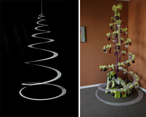 |
| Spiral cut suspended tree |
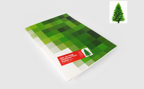 |
| Christmas tree poster as an alternative to the real thing |
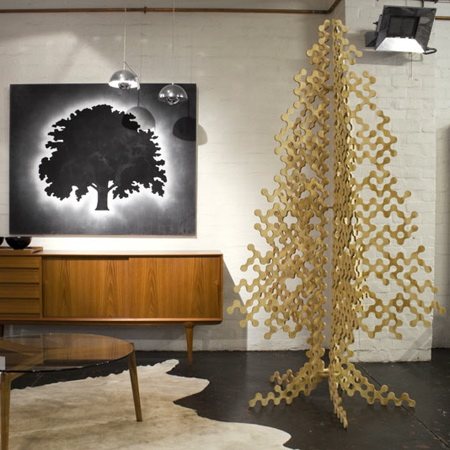 |
| Another alternative tree, bare and minimal |
See, to me, all the above trees seem very innovative in terms of their design and look and yes, they do go along with the modern trend, but is it just me who feels they seem a little cold and lack the festive spirit? The idea of replacing a tree with a poster seems to extreme to me and even though I love minimal designs and simplicity, there is a point where people need to stop, especially with a Christmas tree! I just seem to love the tacky lights, tinsel and bauble idea and would much rather have the following in my home during the season to be jolly;
 |
| Ours at home is a little more wonky and uncivillised compared to this but isn't that what Christmas is all about?! |
Anyways, enough of me rambling! I should be back on here between Christmas and New Years with further updates about the life, times and designs of me so in the meantime, everyone have a great Christmas!
Advert of the Week 9: I can't believe I'm saying this.....The Beatles
I've kind of shocked myself since this advert has been on with liking it (I'm not a huge fan of The Beatles...ok I really don't like them, please don't hate me)! Recently, the band's entire back catalogue have finally been uploaded and made available on iTunes, something which I automatically assumed has been done ages ago. Anyway, I've ended up really enjoying the set of four adverts, each to a different and notable Beatles song, promoting this. The one above to 'Let It Be', the song I can stand the most of the four (and end up singing along to but shhh), is played against the same slideshow of images of the band in their prime. The black and white photos are stunning and the content of each is real and raw, much like the music making of the band themselves. The simplicity of this also struck me, with no fancy use of CGI or special effects, just a nicely timed reel of images to an iconic track. Another thing which I really liked about these adverts is the lack of need to even mention the band's name, with the photographs of the members being instantly recognisable without plastering logos and writing around. Merely a strap line at the end states 'Now on iTunes', allowing the viewer to discover the point of the advertisement whilst leaving you with a sense of curiosity to go on there and find out more (something which would have been diminished should tracks and albums have been reeled off). The piece closes on an image of John and Paul during their happy period (as I've been told my boyfriend who adores them), with the Apple logo hovering over the top. All in all, despite my preferences in music, no one can doubt the influence of The Beatles and their recognisable tracks and I feel this ad has been beautifully done in a poignant and sophisticated manner to honour their memory and long-lasting reign in the music world.
Designer of the Week 9: Adrian Frutiger
I blame year one, semester two of University for my huge liking of this guy. As you may have seen from my online portfolio on my website (shameful plug, www.liannamaydesign.co.uk ), our first solo brief of university life led us down the route of promoting a font for its unique qualities. And that was when I fell for Frutiger...

Ever since, I haven't been able to stop using Frutiger in my work! As a type designer, Adrian also came up with the very popular Univers, OCR-B and Avenir; all very powerful and modern sans serif typefaces. Frutiger to me feels like a refreshing change from Helvetica and I love how I'm now identifying small variations between different fonts and typefaces (probably a good thing seeing as I'm embarking upon a History of Typography module after Christmas)! Anyway, I shall leave you with this very interesting link about Adrian Frutiger whilst I get on with my Christmas shopping; http://www.linotype.com/720/adrianfrutiger.html enjoy guys!

Ever since, I haven't been able to stop using Frutiger in my work! As a type designer, Adrian also came up with the very popular Univers, OCR-B and Avenir; all very powerful and modern sans serif typefaces. Frutiger to me feels like a refreshing change from Helvetica and I love how I'm now identifying small variations between different fonts and typefaces (probably a good thing seeing as I'm embarking upon a History of Typography module after Christmas)! Anyway, I shall leave you with this very interesting link about Adrian Frutiger whilst I get on with my Christmas shopping; http://www.linotype.com/720/adrianfrutiger.html enjoy guys!
A potential change in direction?
Like a nugget, I was up until 5am this morning pondering over a new direction in branding 'me' as a designer. As you all know, I've run this blog and the corresponding website, Twitter and forums for a while now but I'm starting to feel they're a little boring, especially when it comes to presenting them in my fifteen page booklet. I uploaded a couple of snippets yesterday and got some lovely feedback via Facebook so I've decided to upload some better quality images for you guys to have a look at and let me know what you think. As a person, I'm really colourful and energetic and I'm starting to lean a little more towards my new design to represent and project this. However, the new design to me feels like I've seen it before. Anyway, enough of me rambling on and on, here are the images; let me know what you reckon!
 |
| Current website design, very plain and simple but I'm only really liking the homepage, the others seem really boring |
 |
| Apologies for the poor screenshot, not created a particular layout here, just exampling a potential new logo and colour scheme? Can you read the logo? |
Pondering...
I know, I know, I should be having a short break before getting back on the working bandwagon but I've ended up stressing over my online promotions project tonight (what can I say? I like to be extremely efficient haha). Anyways, I've been looking at some layouts and griding bits and bobs up for my 15 page booklet but feel I'm stuck between a rock and a hard place in making it interesting and innovating rather than a mundane 'I love Helvetica' graphic design piece. Also contemplating totally revamping my website with new logos and layouts and everything as I've got myself under the idea that currently, it is rather boring (although the new things I keep coming up with also seem a bit generic). Another issue I'm having it matching my design booklet to the website/logos etc. Do I have to do this you reckon? Is anyone else doing it? I feel like I should but when put together, I start not liking my website as it restricts booklet designs. I need to stop moaning haha! Anyone fancy dropping me a few comments/ideas/inspiration? Would be very much appreciated!
In other news, I've decided if all else fails in the world of graphic design/teaching for me, I shall become a cook. I made a mean Christmas dinner today, amazing when I don't even eat veg and had to cook tonnes!
Ooo, whilst I remember, has anyone seen the new Andrex puppies advertisement (which has conveniently just come on TV as I typed that, creepy!)?
Is it just me who doesn't like the new CGI puppies?! Bring back the real, cute ones please Andrex!
 |
| Kinda hard to see as there's no border. What do you reckon to the layout and logo? Boring? Argh! |
 |
| Another example page from my current website design |
 |
| A new little idea for a logo but I feel like I've seen it hundreds of times before and I don't really think it's me :/ |
(there's a little link if you fancy popping over there, having a look and giving me a hand...please?)
In other news, I've decided if all else fails in the world of graphic design/teaching for me, I shall become a cook. I made a mean Christmas dinner today, amazing when I don't even eat veg and had to cook tonnes!
Ooo, whilst I remember, has anyone seen the new Andrex puppies advertisement (which has conveniently just come on TV as I typed that, creepy!)?
Is it just me who doesn't like the new CGI puppies?! Bring back the real, cute ones please Andrex!
Subscribe to:
Posts (Atom)