Am I the only person who seems to prefer PCs to Macs?

Probably because of how long I've used them for in comparison to Macs (well over a decade in comparison to just over a year) but I still can't get used to them. Spent half of my class today with my little finger searching for Ctrl. The class in which we got our workbook! Seems like my kind of thing, 23 illustrations what we've got to work up on, well, Illustrator. Didn't get far in class but I've been having a little go at them since I've been home, I can't believe we have three weeks to do them for half of our grade, seems rather nice of Leeds Uni! On another note, it's pasta crit time tomorrow...DUH DUH DUHHH!

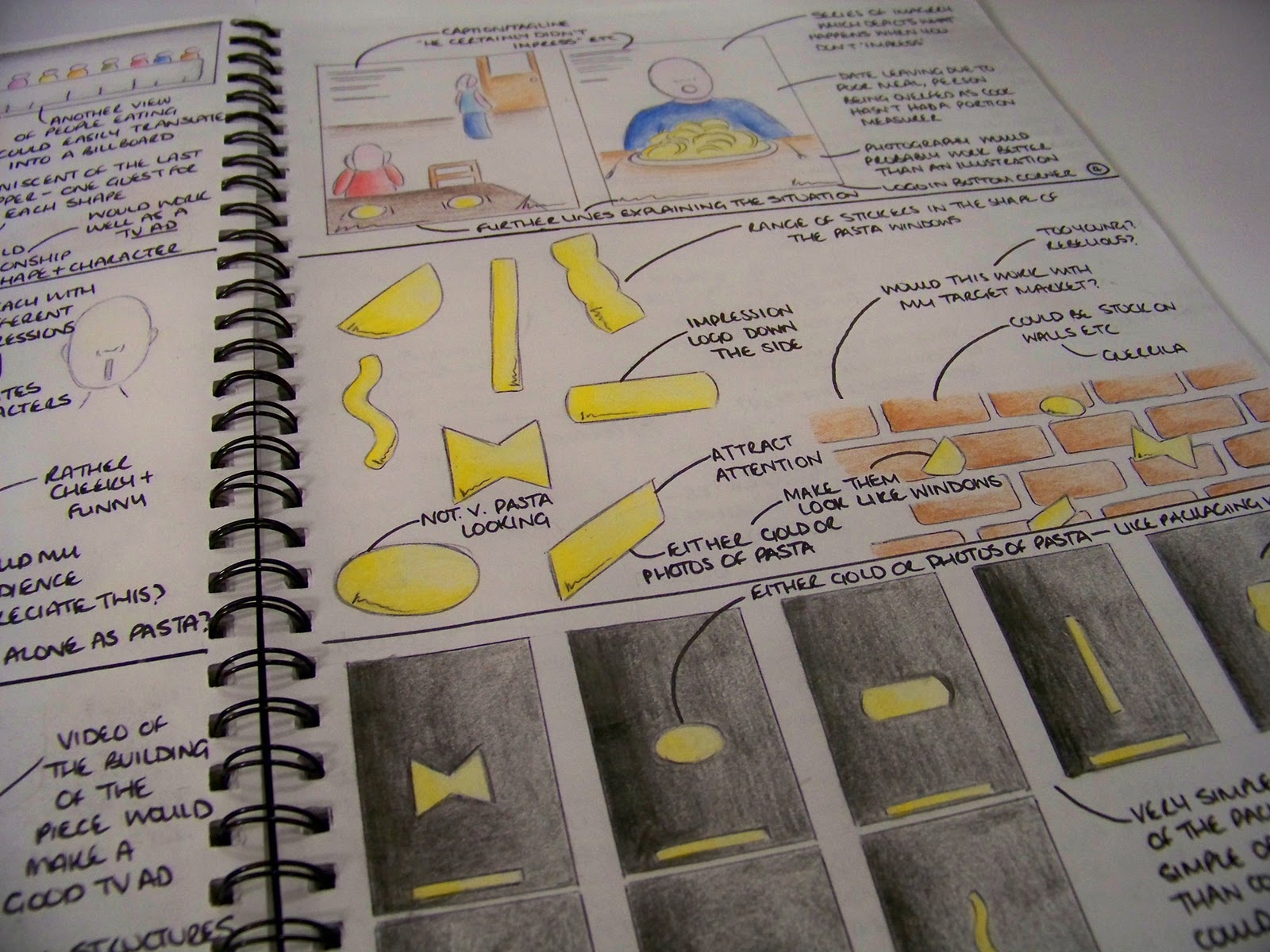
Spent the past week just coming up with some ideas for campaigns and the media which I could use to portray the campaigns etc. Had a few ideas but seem to have stuck on one, rather simple idea (which I am hoping is approved tomorrow as it would make my life lovely). Running with the unique windows of my brand as the selling point, using them across the potential campaign to create a strong recognition of the packaging and design when seen in store. Literally thinking black background, gold/pasta filled windows on. Potential tagline of 'What's your Impression?' or something along those lines (trying to include the audience and asking them which shape of the range is their favourite; I'm thinking this line is gunna need a lot of work). Very minimal, much like my lil' cylinders and I'm scared the tutors may think 'oh, what a cop out' but simple sells right? In terms of media, the simplicity of the design makes it easy for my to create adshells, billboard, an animation (for tv or web), website, promotional carrier bags and a magazine campaign. We're only meant to be doing two media but I may end up doing more to make up for the simple look. Maybe. Anyway, one of the ideas was to create a structure within an adshell which could actually hold pasta, recreating the packaging itself and creating that bit more interest. May be hard to create this across other areas of the campaign though. Anyway, here are a few sketches and pages from my sketchbook with my other ideas too (none seem quite as strong/desirable as my main idea so fingers crossed for me tomorrow guys):


Initial brainstorm
One of my messy sketch pages
Another messy page of my brain exploding

Neater ideas
Few more ideas including a concept of people not impressing as they haven't used Impression. Not the strongest of ideas...
You can kinda see what I mean with the bold and simple thing. Few ideas for outcomes
Few more media ideas


Bold and effective? Or a bit too simple? Let me know what you think, remember, it's got to reflect my brand and its values!

So it's Sunday 5...

Wow, been rather stressed out recently, feel like I have tonnes to do and very little time! Enjoyed a loooong weekend at home in the lovely Sheffield and now have that Sunday night Syndrome. Kinda looking forward to tomorrow, we're getting a new workbook to work through for our online promotions. Apparently it's just lots of sketches for us to trace in Illustrator, something quite up my street hopefully as I did tonnes of that over summer. Hopefully, it will be nice and lovely. Marketing is getting rather stressful, there are pieces missing from some members and it's sending me loopy! O well. In terms of pasta, I've had a kinda ok campaign idea but I'm a little scared of the tutors thinking it's too simple and boring. But simplicity works in the world of advertising doesn't it?!

Anyway, enough of me wittling, I'm keeping tonight rather short and sweet as Take That are performing as a five-piece for the first time in ages. Yeah, I'm a sucker for the X Factor haha! Keep an eye out for my blog entry tomorrow as I'm hoping to upload a few sketches and ideas for you guys to crit before my Tuesday session!

Friendly Friday 4

Like I said last week guys, not many people have their blogs and sites set up for me to recommend you to so for this week, I'll leave you with something amazingly uplifting and just pure lovely to start your weekends. Just wow at today's technology:

Advert of the Week 4: T-Mobile

I didn't think it'd work again when I heard T-Mobile were doing another mass performance. I was wrong. Some fantastic singers feature in this advert and it takes it to another dimension where dancing couldn't. Anyone who doesn't crack a smile at this can't have watched it right. So many great songs in there, I'd forgot about half of them, definitely a tune in there for everyone. It has stuck in my head all week and is such a great example of advertising a product/service via methods which seem to have absolutely no relevance until the final message; Life is for Sharing. It's great how everyone who aren't in on the act get into it and start singing along!

Designer of the Week 4: Saul Bass

Bit of a blast from the past tonight with someone who I studied during my Graphic Design A Level. I'm not one for intricate, complicated art and this guy delivers his messages clear and simply: love him.


Although well known for his graphic design pieces and films, he is better known for his amazing movie title sequences. Collaborating during his lifetime with Alfred Hitchcock, Stanley Kubrick and Martin Scorsese, Bass' work has been featured on many films including North by Northwest, Veritgo, Psycho and his most recognisable piece, The Man with the Golden Arm.

His distinctive, hand rendered style is instantly recognisable and his limited colour palette for each piece makes them eye-catching, bold and straight to the point, a trait which I would love to bring to my own design work. Enough of the writing stuff now, here are some examples of my favourite Saul Bass pieces:


The Man with the Golden Arm poster. The amount of times I drew this at A Level was unbelievable. Although I've never seen the film (though I reckon Ii should, Frank Sinatra is in it, top guy), I love the poster for it's simplicity, hand rendered look and restricted palette.

Vertigo movie poster. Doing this is making me realise how limited my film spectrum is! Another example of Saul's restricted palette and hand drawn designs. His style is emulated across all of his work, creating an instantly recognisable range

Anatomy of a Murder poster, another infamous Bass piece

Ooo, love coming across something new, just found this piece by Bass and I think I've fallen in love. Sometimes, the best designs are simple, clear and straight to the point. Wow, I fancy going off and drawing some Saul Bass stuff now!

Crit Tuesday 4

I didn't go, oops.
Wasn't feeling very well so I hope I didn't miss much.
Off to try and get some rest so I feel better for tomorrow via excessive viewing of

(A programme which has excellent titles by the way, a very nice thread of blood sweeps over the gorgeous font and drips through the 'canine tooth' V. And is generally a wicked programme haha)

Sorry about the boring entry today, I'll make it up to you guys I promise!

I can't imagine tomorrow is going to be a crit...

...so I'll keep this short and sweet. As you guys know, my latest brief (as predicted) is to now market and create campaigns for my new pasta brand. One week in and I'm currently in the research stage (trying to not go too over the top like I did for the last project - whoops). I have a few ideas but I'm not going to reveal them yet (for one, I want some approval, two, they need development and three, I fancy keeping them to myself for a while hehe). My blog wasn't born when I was going through the early stages of my previous projects so the next couple of Tuesday entries might not be too exciting but I shall try and keep them as entertaining as possible. Anyway, I shall leave you with my newly found fact of the day:

It isn't the best idea to wear your skinniest jeans during a day of torrential rain

They end up being very hard to get off

Or get back on!

And on that note, I shall love you and leave you and go get my spaghetti on toast (tinned variety of course, if I wasn't a hater of dried pasta enough before, I certainly am now!)